The closed sales count report is a powerful tool that gives you visibility into how many of your leads have converted to sales. In order to utilize this function within Aimbase you must have both registration and lead data present.
Before getting started, there are a couple of rules that Aimbase uses to produce these calculations and metrics to be aware of.
1. The date of the lead must pre-date the date of the registration in order for the two to be matched.
2. Aimbase looks back 2 years prior to the purchase date of the registration for a match. If a lead converted to a sale but it took more than 2 years for the consumer to make the purchase, a match will not occur.
Watch the Closed Sales Count Report Dashboard Video
What is shown in the Closed Sales Count Tab?
To begin using the report, first select the time frame in the top-left corner. Please note that the date range you're selecting is the purchase date. This means that Aimbase will look at registrations with purchase dates between these dates and look backwards at lead data to try to find a match.
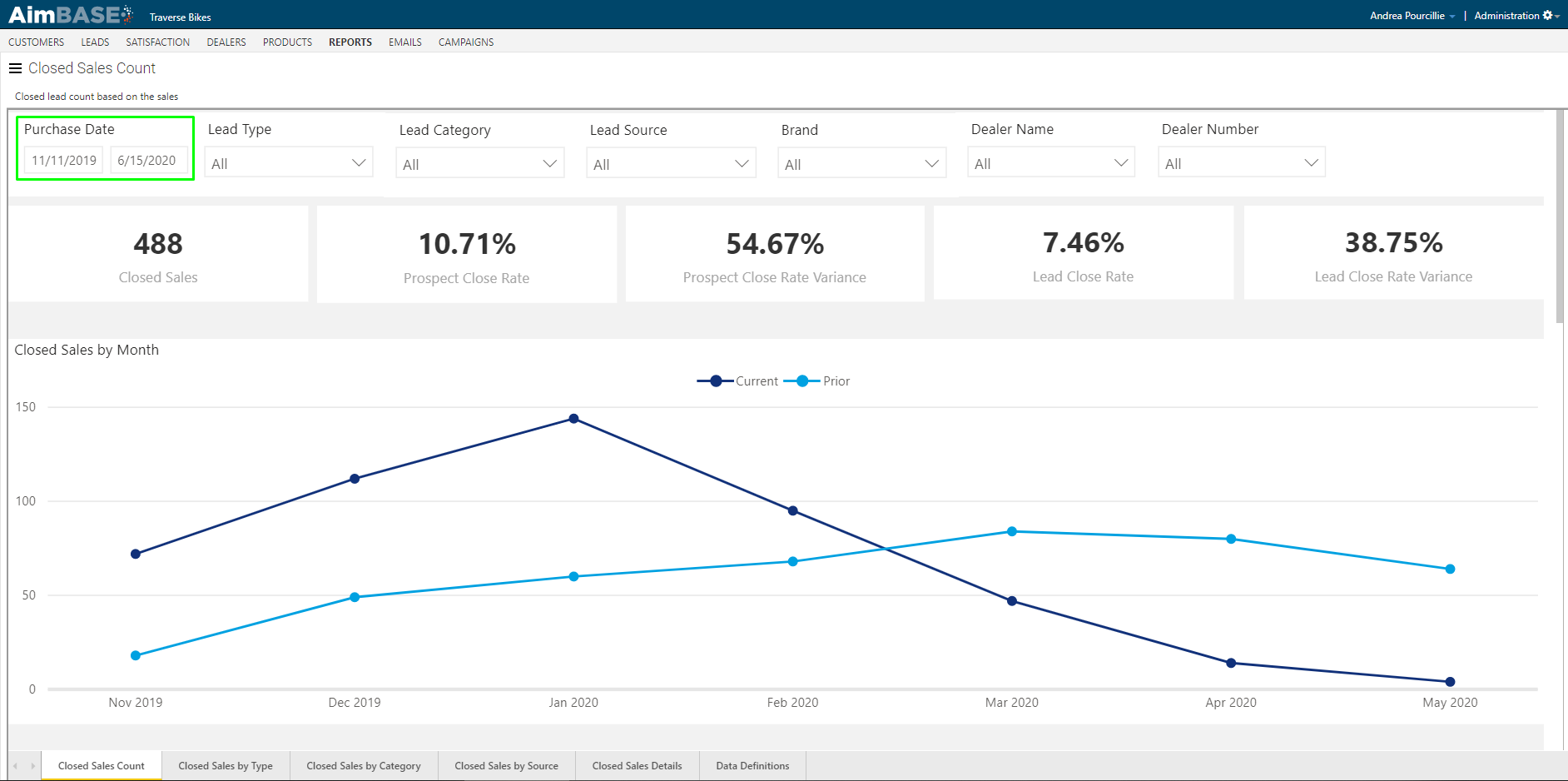
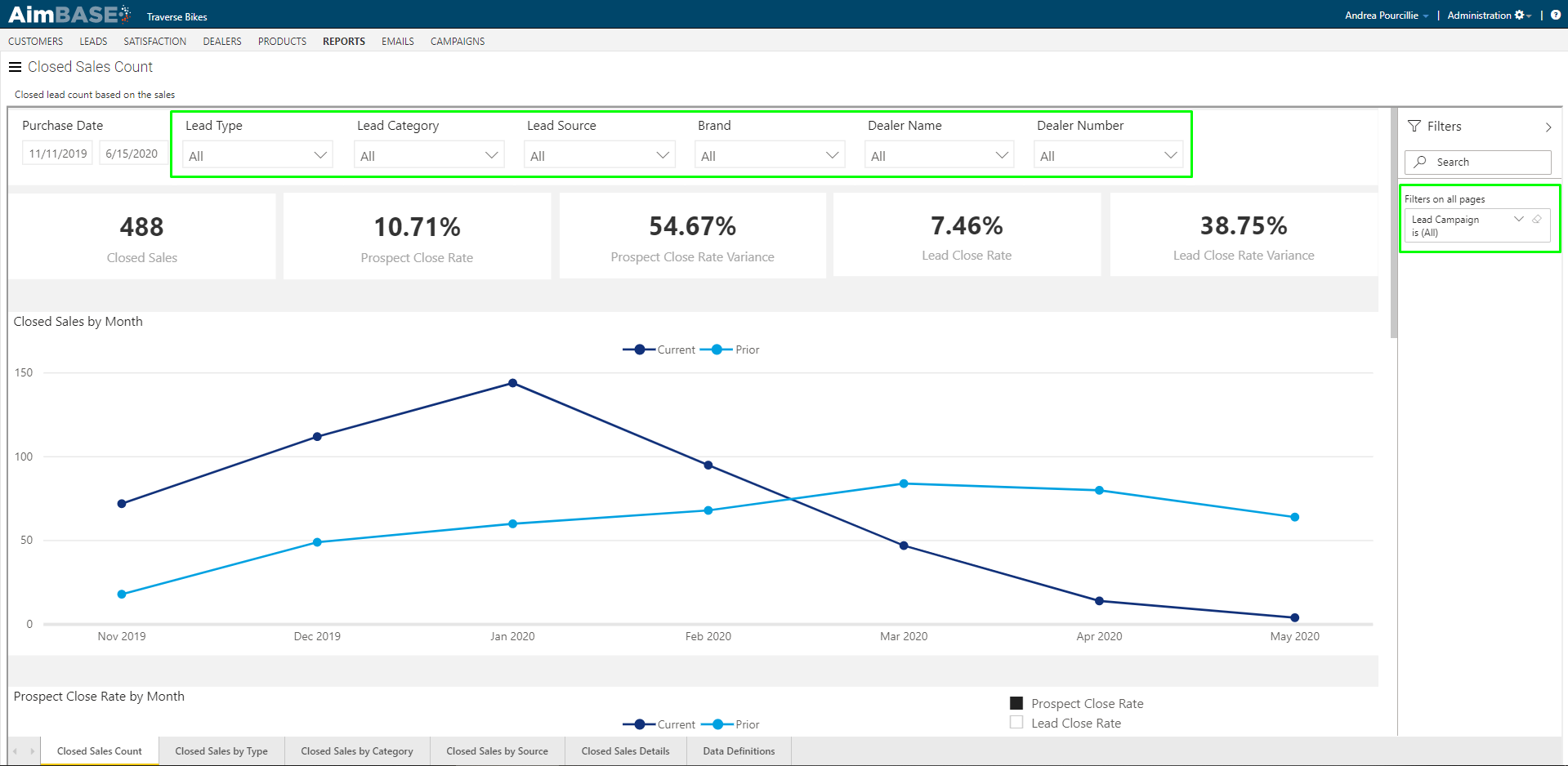
You're also able to filter the data down by lead type, lead category, lead source, brand, dealer name/number, and lead campaign. To utilize the lead campaign filter open the panel on the right of the report to access the filter.
The benefit to utilizing these filters is that if you want to measure how a particular marketing tactic performed, these filters typically will allow you to parse down to the relevant data. For example, if you ran a campaign around a product launch that included paid media and/or email blasts (which also included tracking URLs), by filtering on the campaign you can see how many of those leads converted to sales and from there determine an ROI for the campaign.
Just remember that any date range or filter chosen will impact the data on each tab of the report.
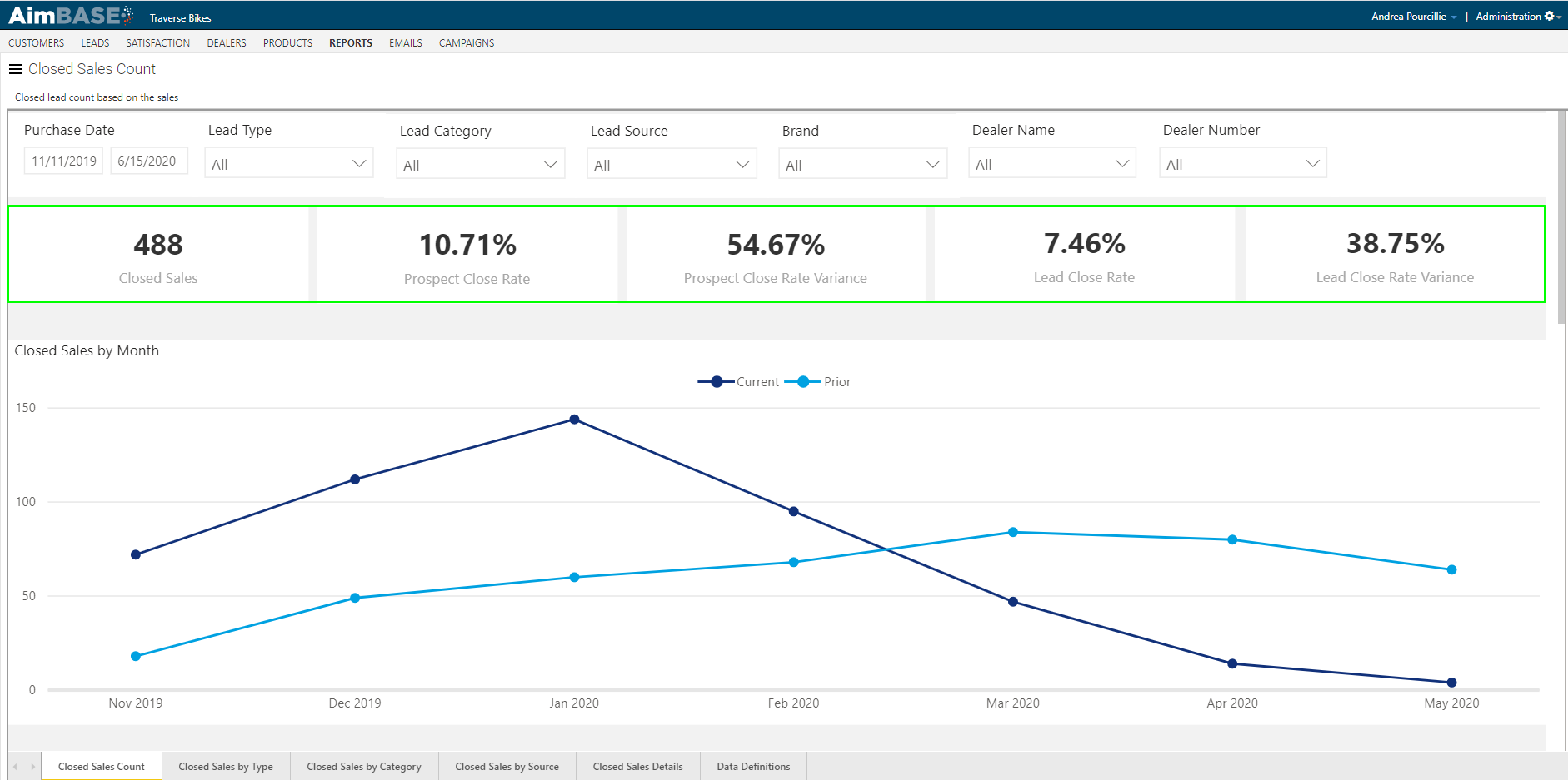
Below the filters are a series of key metrics. In this report the metrics being highlighted are closed sales, prospect close rate, prospect close rate variance, lead close rate, and lead close rate variance. The closed sales metric will tell you how many registrations based on your filters matched to leads. The prospect close rate will tell you the rate at which registrations matched to people who entered a lead. The prospect close rate variance indicate the change in the prospect close rate from the prior time frame. The lead close rate tells you the rate at which your registrations matched to leads, and the lead close rate variance indicates the change in the metric from the prior time frame.
The important different to note here is between prospect close rate and lead close rate. Remember that a prospect is defined as a person and a lead is an instance of one of those people submitting a form. When measuring prospect close rate you're able to get a better idea of how many people within your database expressed interest and then ultimately bought. The lead close rate could include multiple leads from the same person.
Below the key metrics is a chart showing trends in the number of closed sales per month. From this view you're also able to see data indicating the same metric for the prior time period.
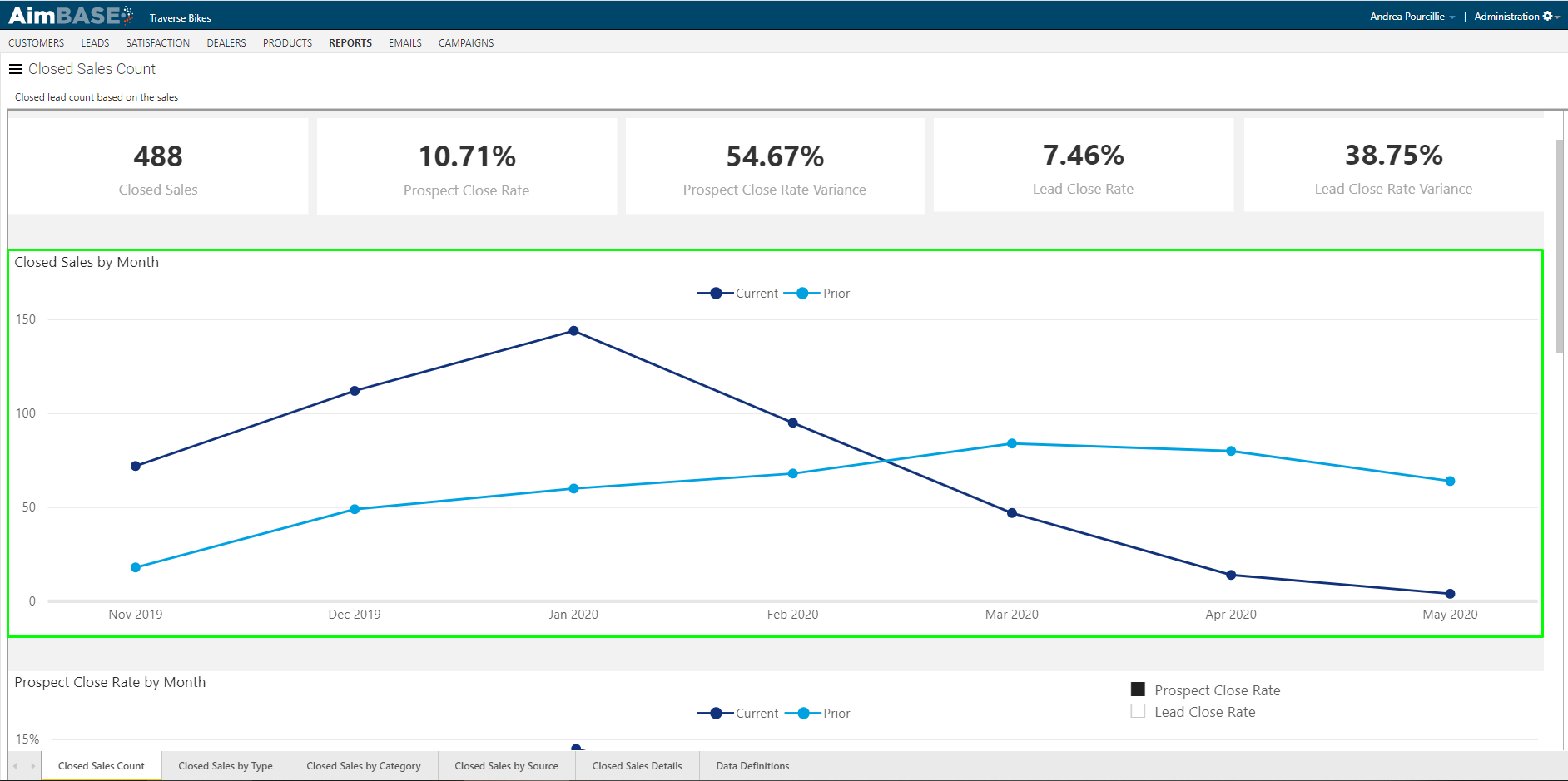
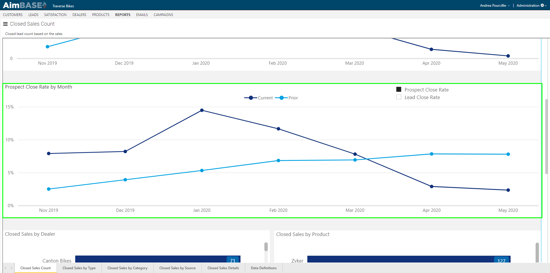
The next chart on the report gives you the ability to toggle between two different metrics. When the report initially loads it will display the Prospect Close Rate by Month. In the top-right corner of the chart you'll see a checkbox to select the Lead Close Rate instead. This chart also give you the ability to see the data for the prior time frame.
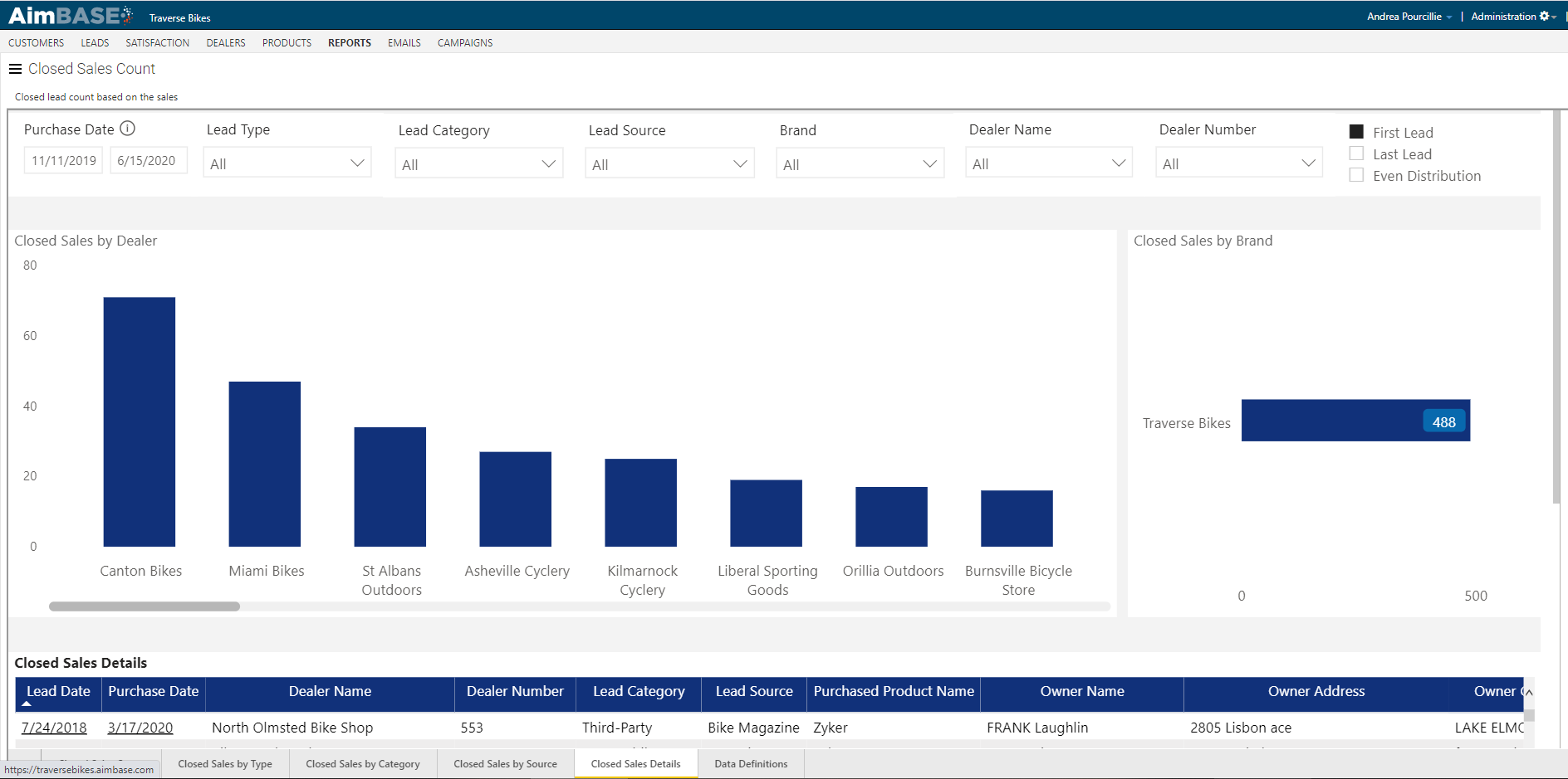
The next available chart on the report displays Closed Sales by Dealer. This view will allow you to identify which of your dealers are having the most success with the leads you're sending them. By scrolling to the bottom of this list or sorting the list by ascending order you'll find the dealers with the lowest number of registrations that have matched to leads.
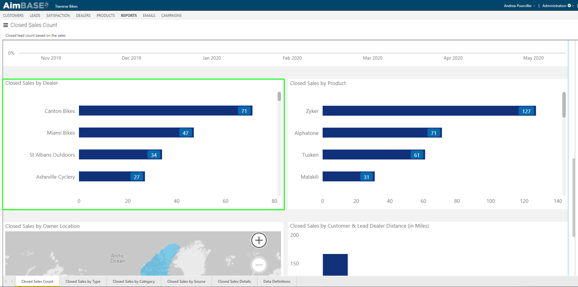
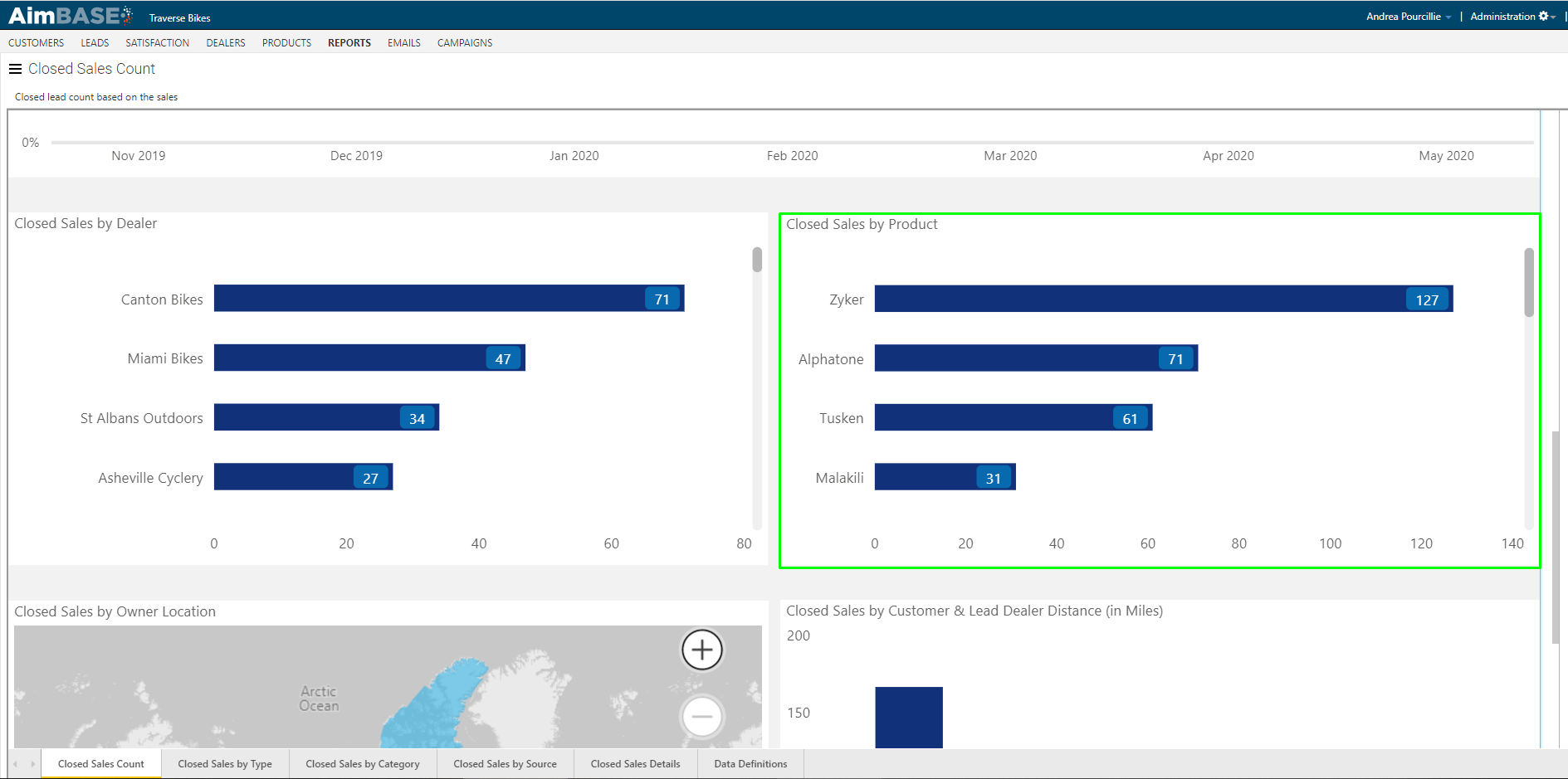
Next to this chart is another view that indicates how your matched sales are distributed across your product line. This view will give you some idea as to which of your products are selling the best based on the time frame and filters you've set.
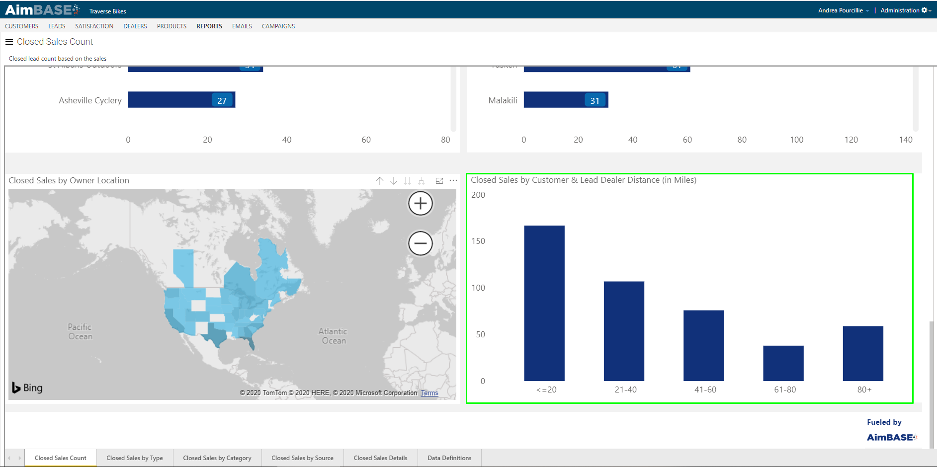
The last row of the first tab features a map that show you the distribution of your owners across the world. You can use the + to zoom into the map. By hovering over the top-right corner, you'll see a double-down arrow. By clicking this arrow, the report will update from displaying the data at a county level to displaying it at a state/province level. If the majority of your sales are within the US and/or Canada, this view may be more useful to you. When interpreting the data, remember that the darker the blue, the higher the volume of data.
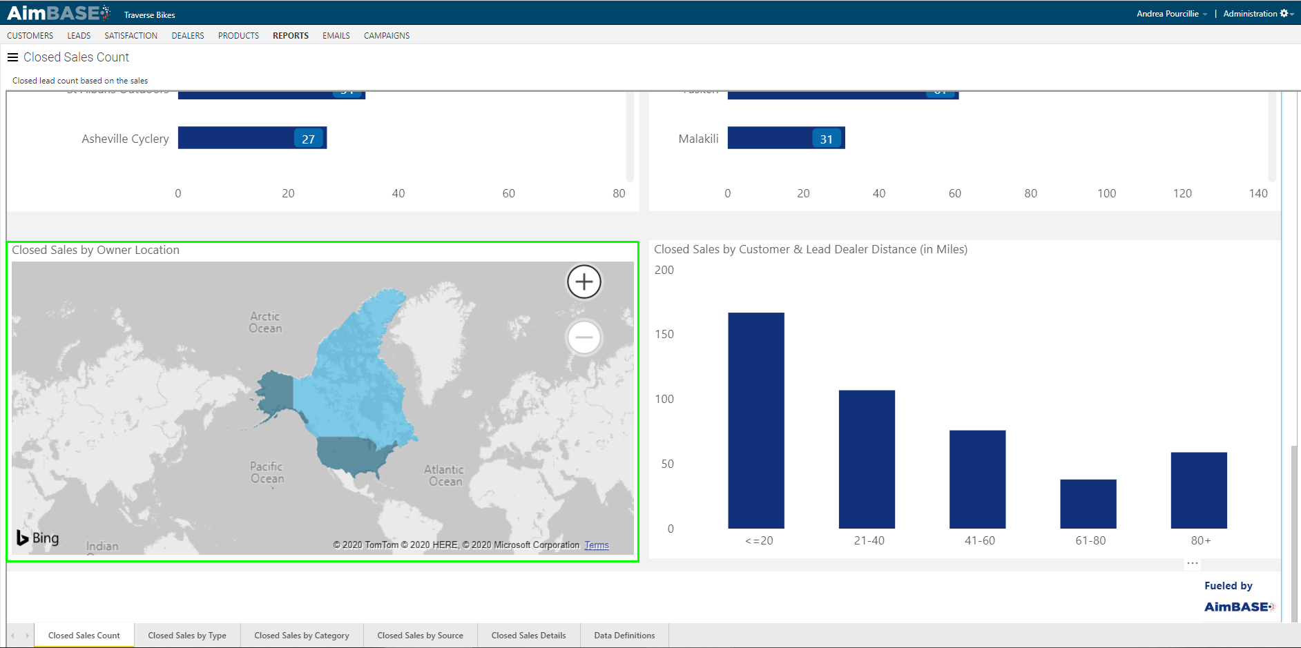
Beside the Closed Sales by Owner Location map is a view that indicates the average number of miles away a lead is from the dealer he/she purchased from. In the example below, the chart is telling us that more of the brand's closed sales are within 20 miles of the selling dealer than any other distance.
Watch the Sales by Type, Category and Source Video
What is covered in the Closed Sales by Type, Category and Source Tabs?
The Closed Sales by Type, Closed Sales by Lead Category and Closed Sales by Lead Source tabs within the report are dedicated to information associated to the lead which matches to a registration. Data within this tab could help you understand which of your prospects is most likely to make a purchase based upon the form he/she submits on the site.
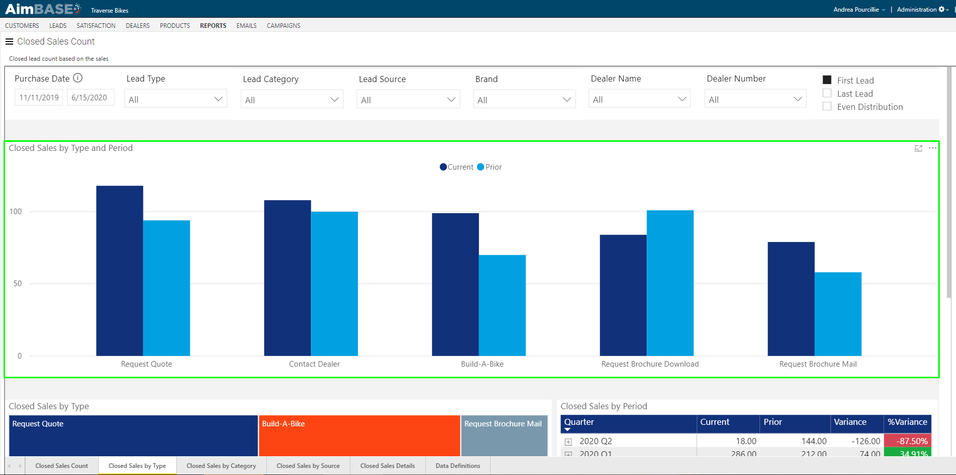
The first tool on this tab to make note of is the toggle allowing you to show your metrics based on the first lead, last lead or an even distribution of leads. To explain why this is relevant, lets consider an example of a buyer's journey.
John Doe is in the market for a new bike, but he is new to bicycling and unsure of which product is right for his need. To begin educating himself, John D. submits a form on the request a brochure download page. After spending some time reading over the brochure, he has narrowed his search down to two bikes and comes back to the site to submit a build-a-bike form for each. Once he has completed his builds, he reviews the information one last time and decides which bike he plans to purchase. He enters one final lead on the contact a dealer form, connects with the dealer, and purchases his new bike. In total, John D. has submitted 4 leads throughout his search for a new bicycle.
When it comes to analyzing the data on this tab you'll want to consider if you'd like to measure it based on the first lead, last lead or an even distribution. In the context of the example above, choosing first lead would give the credit of the matched sale to John D.'s request a brochure lead. Choosing last lead would give credit of the matched sale to his contact a dealer lead. Choosing even distribution would give 25% of the credit to each of the 4 leads he submitted.
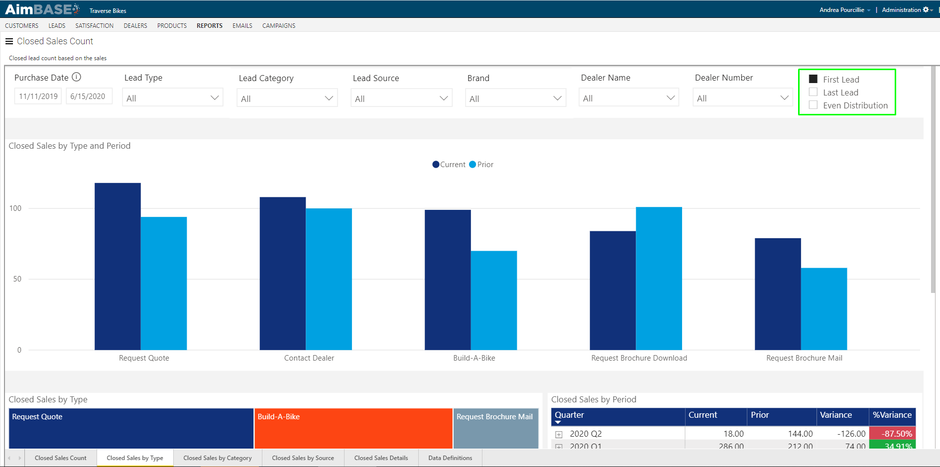
The first module in each tab, which looks like a traditional bar graph, shows you how many registrations matched to leads and which lead type each was (category or source depending upon which tab of the report you're looking at). The darker blue will indicate the matched closed sales from the current period, and the lighter blue will indicate the volume of matched closed sales from the prior period.
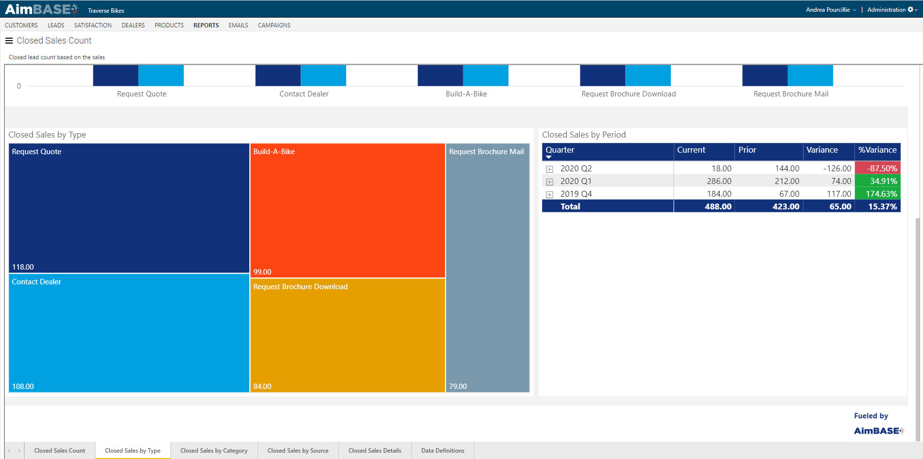
The second row displays the Closed Sales by Type module which assigns a color to each lead type, category or source and gives you a visual representation of the difference in the amount of closed sales for each.
The Closed Sales by Period shows how many registrations matched to leads within a given time frame. By default the table displays the data by quarter. By using the single drill down, double drill down, and double down split arrows you can expand multiple data sections one at a time or all at once or view the data by month.
Watch the Closed Sales Details Video
What information is provided in the Closed Sales Details Tab?
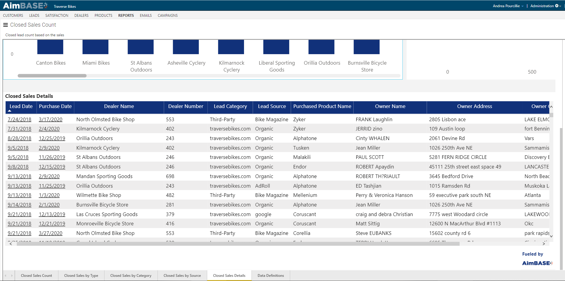
The Closed Sales Details tab gives you an advanced look at all the registrations which have matched to leads within your database for the given time period.
The first module in the report allows you to see at a glance which dealers hold the most closed sales for the time frame of the report. Use the left/right scroll on this report to see more dealers.
The second module within the tab shows how the closed sales for the time frame are spread across the brand(s) in your Aimbase install. In this example there is only one brand, so the data is represented by a single bar.
At the bottom of the tab is a detailed look at the records that make up the report. This list shows the relationship between the registration and the lead it matched to. By clicking the lead date on a given row, you can navigate to the original lead that was entered. By clicking on the purchase date, you can navigate to the registration details.
FAQs
What does the Closed Sales Count Report measure?
The Closed Sales Count Report measures how many leads have converted into closed sales by matching lead data to registration data within Aimbase.
What data is required for the Closed Sales Count Report to work?
Both registration data and lead data must be present in Aimbase for this report to generate results.
What rules does Aimbase use when matching leads to registrations?
Aimbase uses two rules:
- The lead date must be earlier than the registration date.
- Aimbase looks back 2 years from the purchase date. Leads older than 2 years before a purchase will not match.
What date range does the Closed Sales Count Report use for filtering?
The selected date range applies to purchase dates on registrations. Aimbase then looks backward from those dates to find matching leads.
What filters can be applied to the Closed Sales Count Report?
You can filter by:
- Lead type
- Lead category
- Lead source
- Brand
- Dealer name/number
- Lead campaign
The lead campaign filter is available by opening the panel on the right side of the report.
How do filters affect the Closed Sales Count Report data?
Any selected filters or date ranges apply to all tabs within the report and will influence all metrics and visuals.
How can filters help measure marketing performance?
Filters—especially campaign filters—allow you to isolate leads related to specific marketing tactics (e.g., paid media, email blasts, tracking URLs) to see how many converted to sales and evaluate ROI.
What key metrics are shown in the Closed Sales Count tab?
The tab displays:
- Closed sales
- Prospect close rate
- Prospect close rate variance
- Lead close rate
- Lead close rate variance
What is the difference between prospect close rate and lead close rate?
Prospect close rate measures how many people who submitted leads ultimately purchased.
Lead close rate measures how many lead submissions matched to registrations, which can include multiple leads from the same person.
What does the Closed Sales per Month chart show?
It shows monthly trends in closed sales for the selected period, including comparison data from the prior period.
What metrics are available in the toggleable Closed Sales per Month chart?
You can view either:
- Prospect Close Rate by Month
- Lead Close Rate by Month
This chart also includes prior period comparisons.
What does the Closed Sales by Dealer chart show?
It shows which dealers have the most matched closed sales and helps identify both top‑performing and low‑performing dealers.
What does the Closed Sales by Product chart show?
It shows how matched sales are distributed across the product line for the selected time frame and filters.
What does the Closed Sales by Owner Location map represent?
It shows the geographic distribution of owners whose registrations matched to leads. Darker blues indicate higher sales volume. Users can switch between county-level and state/province-level views.
What does the Lead Distance chart show?
It displays the average distance between a lead's location and the dealer they purchased from.
What are the Closed Sales by Type, Category, and Source Tabs used for?
They provide insights related to the type, category, or source of leads that matched to registrations.
What does the first/last/even toggle on the Closed Sales by Type, Category, and Source Tabs do?
It allows you to choose how credit for a sale is assigned across multiple leads from the same person:
- First lead: All credit goes to the earliest lead submitted.
- Last lead: All credit goes to the final lead submitted.
- Even distribution: Credit is evenly split across all leads submitted by that person.
Why is the first/last/even on the Closed Sales by Type, Category, and Source Tabs toggle important?
It helps you analyze the buyer journey by determining which touchpoints deserve credit in lead‑to‑sale attribution.
What does the Closed Sales by Type module show?
It shows how many registrations matched to leads within each lead type, category, or source. Current period data is darker blue; prior period data is lighter blue.
What does the Closed Sales by Period table show?
It shows how many matched closed sales occurred during each time period, typically by quarter. Drill‑down options allow switching to monthly views.
What does the Closed Sales Details Tab dealer performance module show?
It displays which dealers have the highest number of matched closed sales for the selected time frame.
What does the Closed Sales Details Tab brand distribution module show?
It shows how closed sales are distributed across brands in your Aimbase installation.
What information is shown in the detailed list at the bottom of the Closed Sales Details Tab?
It shows all matched registration–lead pairs for the selected time frame.
- Clicking a lead date opens the original lead.
- Clicking a purchase date opens the registration details.