
The Dealer Response Activity report allows you to see data pertaining to if your dealers are viewing their leads and how soon after they receive the leads the dealer is viewing them. This data is important for your organization because it allows you to promote the conversion of leads to sales and set goals for your dealers and sales team for lead follow up times.
One thing to understand is how Aimbase defines a lead is viewed. Within Aimbase leads are assigned to someone at a dealership by identifying which email address will receive the Lead to contact type. Whoever receives the Lead to email notification about the lead is who needs to open the lead in order for it to be viewed; that is to say, if Aimbase sends an email to joe.smith@smithandsons.com, the View Lead link in that specific email must be clicked. If another member of the team received an email because he/she is associated to the contact type of Lead CC and forwards his/her email to joe.smith@smithandsons.com as a reminder to follow up and Joe Smith clicks the link in the forwarded email, the lead will not be viewed. In this example, Joe could also log in to Aimbase and view the lead through the platform itself as long as login he is using is also associated to the email address joe.smith@smithandsons.com.
At the top of each tab of the report are the default filters that control the data displayed in all subsequent tabs. These filters give you the ability select a specific date range, dealer number, region, brand, etc. to narrow your data. Be sure to select your desired filters before reviewing the data.
What information in shown in the Trends section?
Within the Trends tab you'll find information about KPIs related to the response rate, what the response rate is by month, and a comparison of the this time frame's response rate against the same time frame for the prior period.
What KPIs are included in the report?
The KPIs portion of the report puts key metrics for you to be aware of at the forefront. Within this section you'll find the total number of leads entered within your selected time frame, the number of those leads that have been viewed, what the percentage of viewed leads equates to, the average time to view a lead, and how that viewed percentage has changed year over year. For this last percentage a positive value means more of your leads have been viewed than before, and a negative value would indicate that dealers are viewing fewer leads than the prior time period.
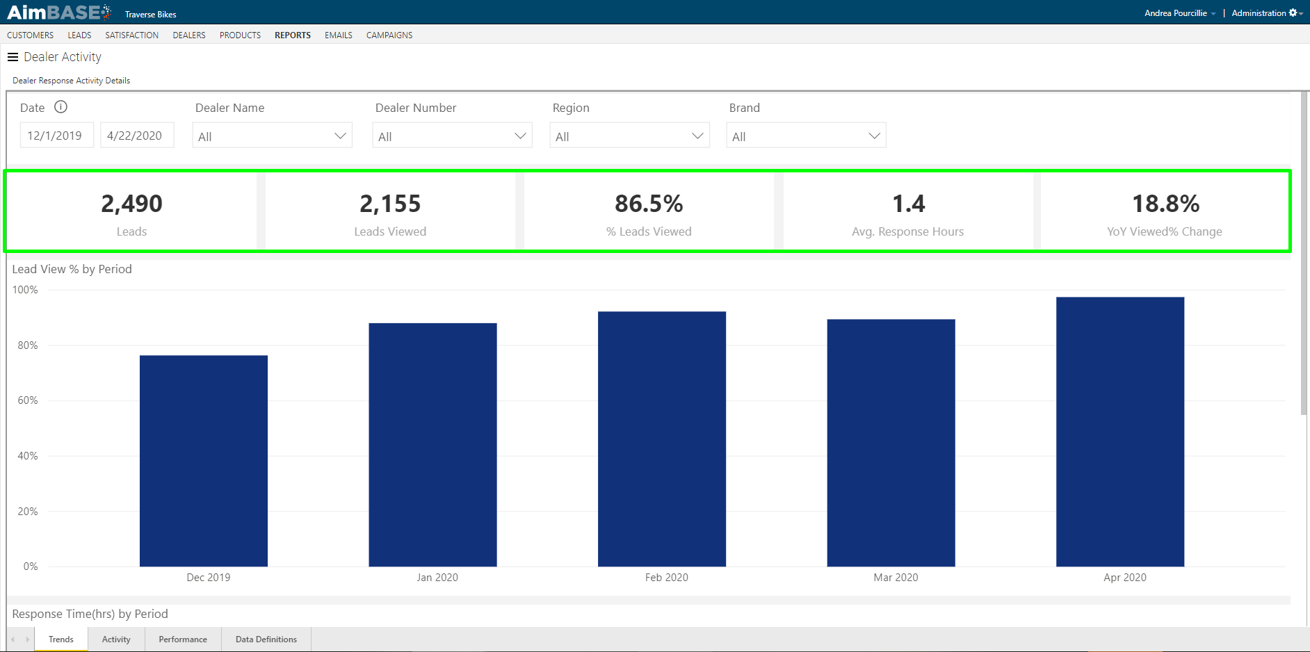
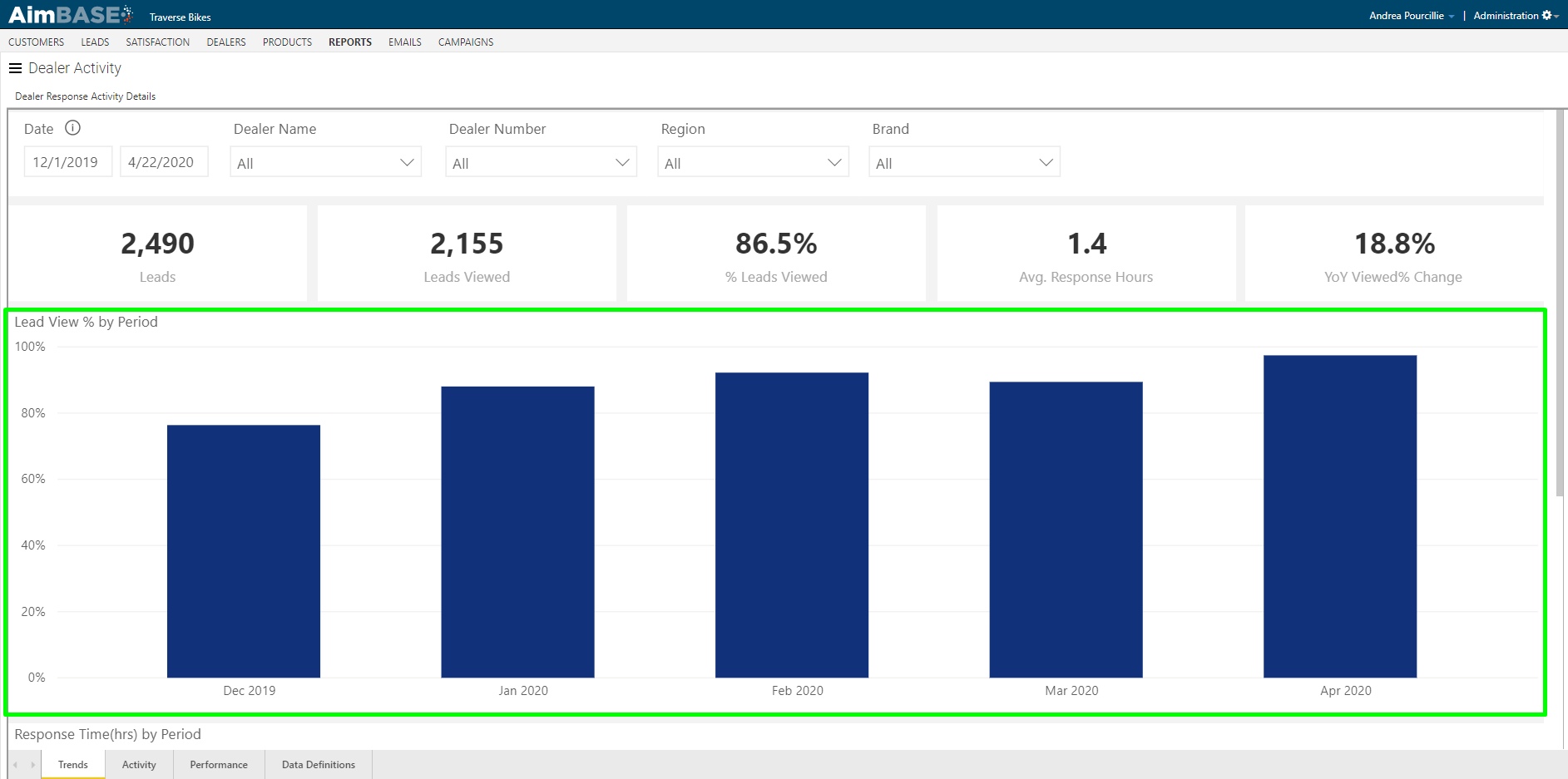
What does the Lead View % by Period section show?
In the first graph Aimbase shows you what your percentage of leads viewed was by month. This graph give you the ability to drill up and see the data by quarter as well by using the drill mode icons in the top-right corner of the graph. If you hover over each bar, a tool tip will appear which provides additional data about the total number of leads that month and what the exact percentage viewed is.
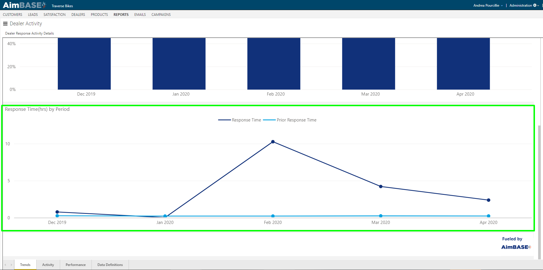
What does the Response Time by Period section show?
The response time that Aimbase reports is in hours. Hopefully the response times on your report are lower than this, but don't forget if you see response times averaging 24, 48, 72 hours, etc. that means you're dealers are waiting days to follow up with their leads.
In the the Response Time by Period graph you'll be able to observe how the response rates for the current time period compare to the time time period of the prior year. Hovering over a specific point for each month allows you to see the specific data nested for the data point.
What information is included in the Activity section?
Within the Activity tab you'll find information relating to the lead response time per dealer. Analyzing the data this way allows you to understand if dealers are not performing the way you'd like or will help to identify situations where perhaps the wrong person (or no person) at a dealership is receiving the lead notifications.
Once once this tab, you'll find a new toggle added to the available filters are the top. Enabling this toggle will filter the modules on the entire tab to only show data for leads that were either distributed to the dealer via email notification or to the dealer via a CRM that sends disposition data back to Aimbase.

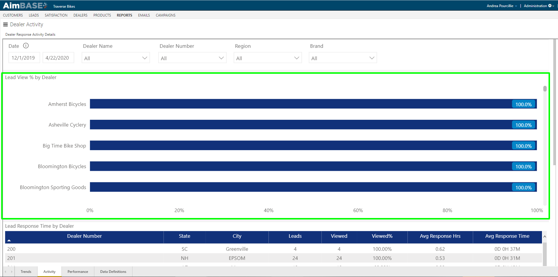
What does the Lead View % by Dealer section show?
The first chart on the tab displays the lead view percentage for each dealer. Don't forget to place your cursor somewhere within the area contained in the green box below when viewing the report and scroll down to see more data. The graph will default to sorting the data to show the dealers with the highest view percentages. Sort the data by descending order to put the dealers who might need more help at the top of the list.
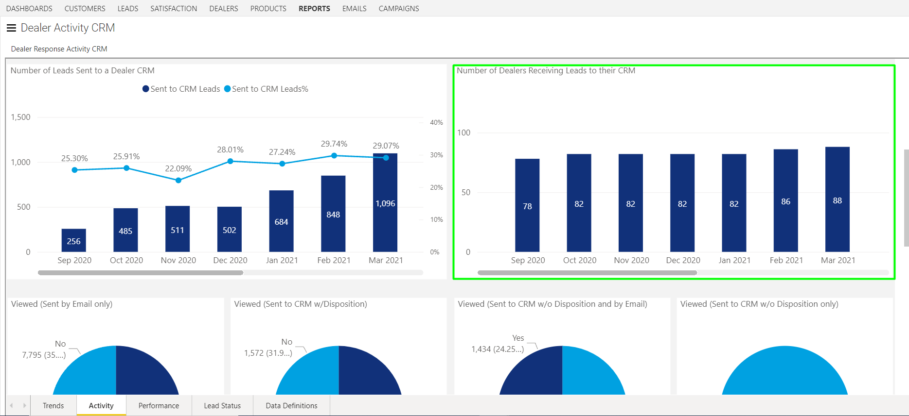
What does the Number of Leads Sent to Dealer CRM section show?
On this module you'll be able to gain insight into how many of your brand's leads are being distributed to your dealers via a CRM integration. As in the example below, you'll see the total number of leads sent to dealer CRMs as well as a trend line representing the overall percentage of your leads this total represents. Make note, that while the counts in this chart represent leads sent to a CRM, these same leads may have also been distributed by other methods as well.
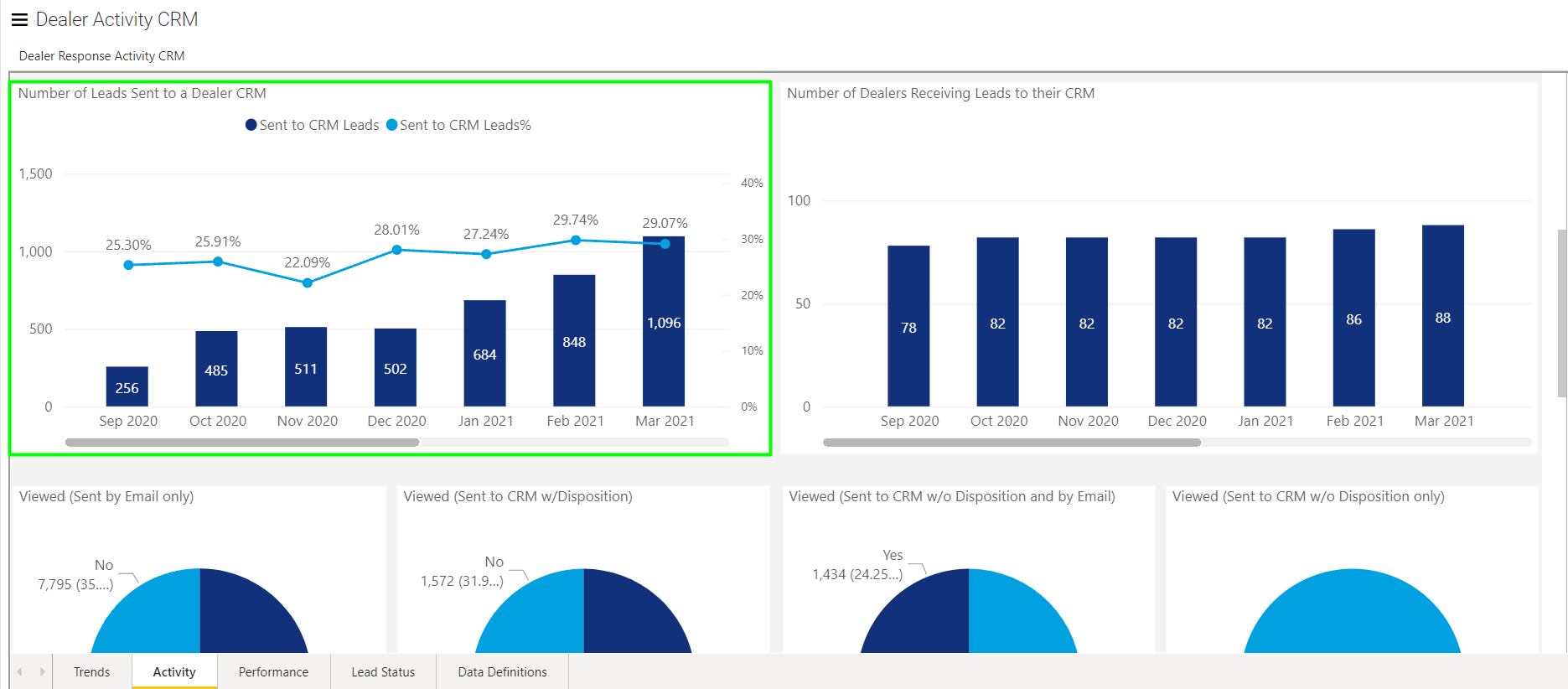
What does the Number of Dealers Receiving Leads to Their CRM section show?
In the next chart, you'll find information about the total number of dealer locations that are receiving their leads within a CRM. In the example below, you'll notice that four dealers were added between February and March. These additional correlate to the increase in total leads distributed via CRM in the chart to it's left.
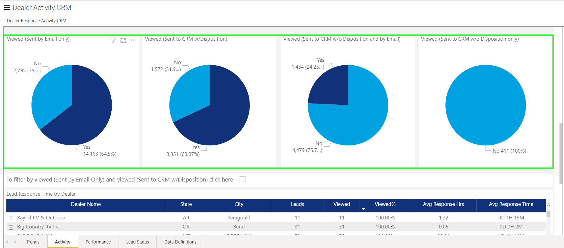
What information is displayed in the Viewed section?
In the following row of the report are a series of pie charts displaying data relating to 'viewed' leads. Each chart represents a more specific subset of leads and how they were distributed to their respective dealers.
All leads distributed to a dealer for the time frame the report is run for should be reported within one of the pie charts below. Data for a single lead is not represented in more than one chart at any given time.
Chart 1 (Sent by Email Only): In this chart is data representing the percentage of leads viewed when Aimbase scheduled only an email notification to go to the dealer about the lead. Notification emails that encounter an issue while attempting to be delivered will be represented within the No portion of this pie assuming that the dealer has not logged into Aimbase and viewed the lead from there.
Chart 2 (Sent to CRM w/ Disposition): In this chart is data representing the percentage of leads viewed when the lead was distributed to the dealer vis a CRM that provides disposition data back to Aimbase. Within this data set, it is possible that the dealer also received an emailed notification about the lead.
Chart 3 (Sent to CRM w/o Disposition and by Email): In this chart is data representing the percentage of leads viewed when the lead was distributed to the dealer by an email notification and to the dealer's CRM when the CRM does not provide disposition data back to Aimbase. Notification emails that encounter an issue while attempting to be delivered will be represented within the No portion of this pie assuming that the dealer has not logged into Aimbase and viewed the lead from there.
Chart 4 (Sent to CRM w/o Disposition only): In this chart is data representing the percentage of leads viewed when the lead was distributed to the dealer only via a CRM that does not provide disposition back to Aimbase.
Each of these charts can be used to filter the data on the rest of the tab. For example, if you wanted to view leads in the Lead Response Time by Dealer table, but only wanted to see leads that were sent to dealers via a CRM with disposition data, you could click on the Yes portion of the second pie chart.
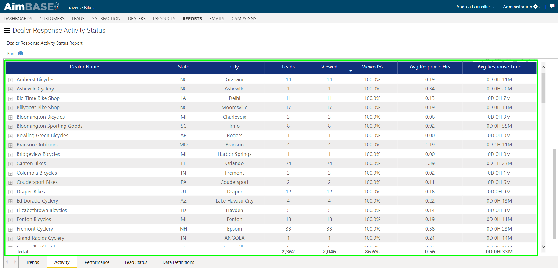
What does the Lead Response Time by Dealer section show?
The final table on the tab displays more detailed information about the data behind each graph. This grid shows you the dealer information, the number of leads assigned to that dealer, how many of them he/she has viewed, the average number of hours it took him/her to view the lead, and that same number displayed for you in days/hours/minutes. At the bottom of the grid are the totals for each of these metrics which are reflective of your overall brand.
Just above the table is a checkbox that acts as a filter. By checking this box you are able to filter the table below to only show leads that have been viewed and were distributed either by email notification or a dealer CRM that provides disposition data back to Aimbase. In other words, it allows you to see a combination for the Yes data from pie charts 1 and 2 above.
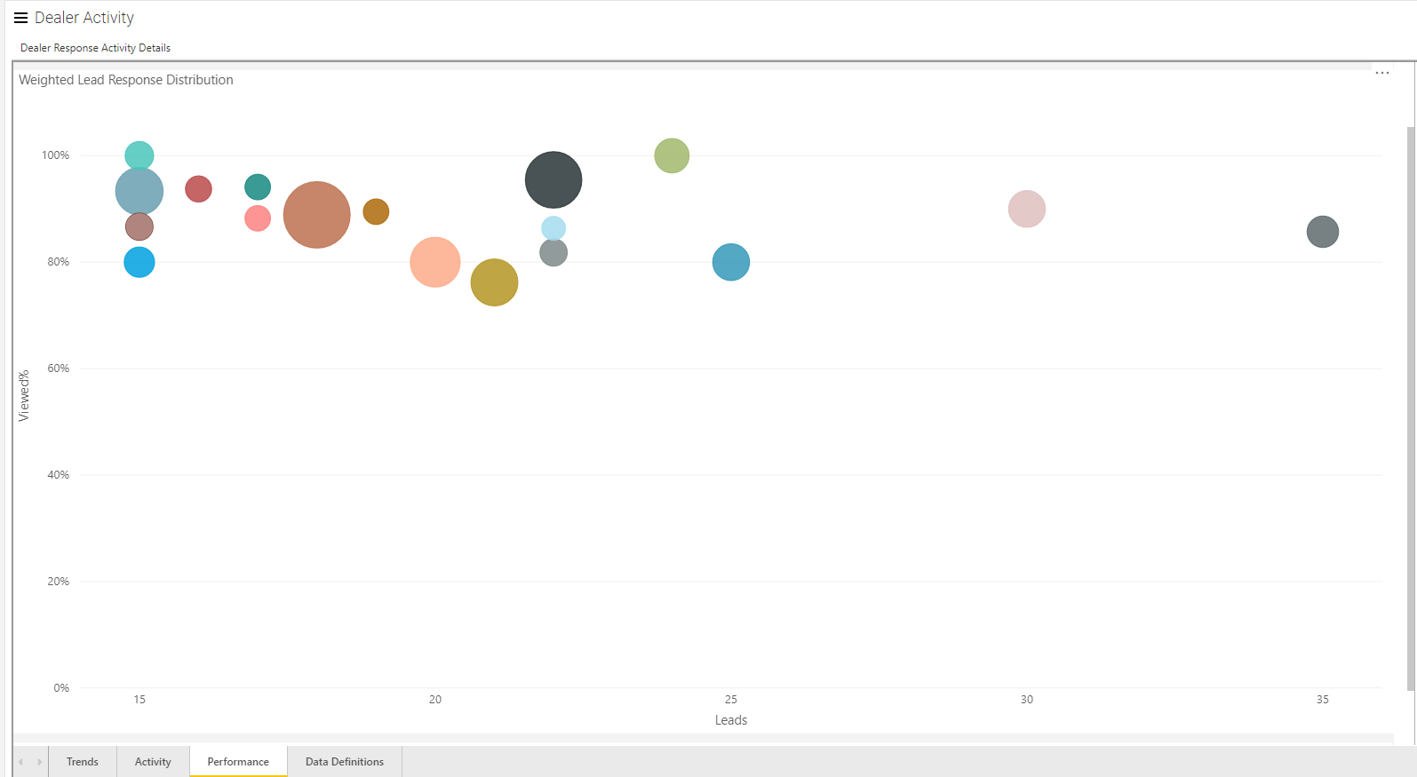
What does the Performance section show?
Within the performance tab there is only one chart to analyze. The Weighted Lead Response Distribution report allows you to visual clusters of lead volume per dealer against the percentage of that lead volume that has been viewed by the dealer. Each colored bubble represents an individual dealer within your platform. You can see the specific metrics that a bubble is reporting by hovering over each one.
The size of the bubble is a visual indication of that dealer's average response time. The bigger the bubble, the longer it takes that dealer to view the lead. Noting the bigger bubbles first could help you hone in on which dealers may have contacts that need to be addressed or dealers who need additional training on your brand's best practices or Aimbase itself.
On the X axis of the graph you'll see the lead volume and the Y axis represents the percentage viewed. The top of the graph equates to higher percentages viewed whereas the right side of the graph indicates higher lead volumes. Ideally, your best performing dealers would be displayed as very small bubbles as far into the top-right corner of the graph as possible.
What information is provided in the Lead Status section?
The Lead Status tab is not one utilized by all manufacturers. Lead Status differs from the flag noting whether or not a lead has been viewed because it provides more insight into the type of work being done with a lead. Examples of statuses you may see in your install are Viewed, Assigned, Working, Sold and Inactive. These status can vary based on how your leads are managed an distributed to dealers.
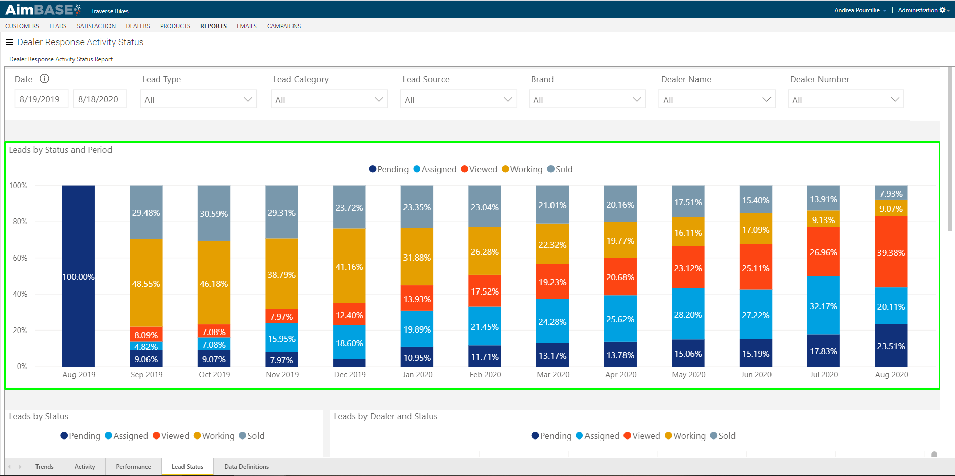
What does the Leads by Status and Period section show?
This first chart within the tab displays that status of leads broken down by month. Within each month, you're able to see what percentage of leads fall within each lead status. Because the data in the report changes as the statuses update, you should be able to see that the older the date, the more leads you have in later statuses (i.e. Working, Sold or Inactive). By using the up and double-down arrows in the top-right corner of the report, you can see this same data quarterly or weekly.
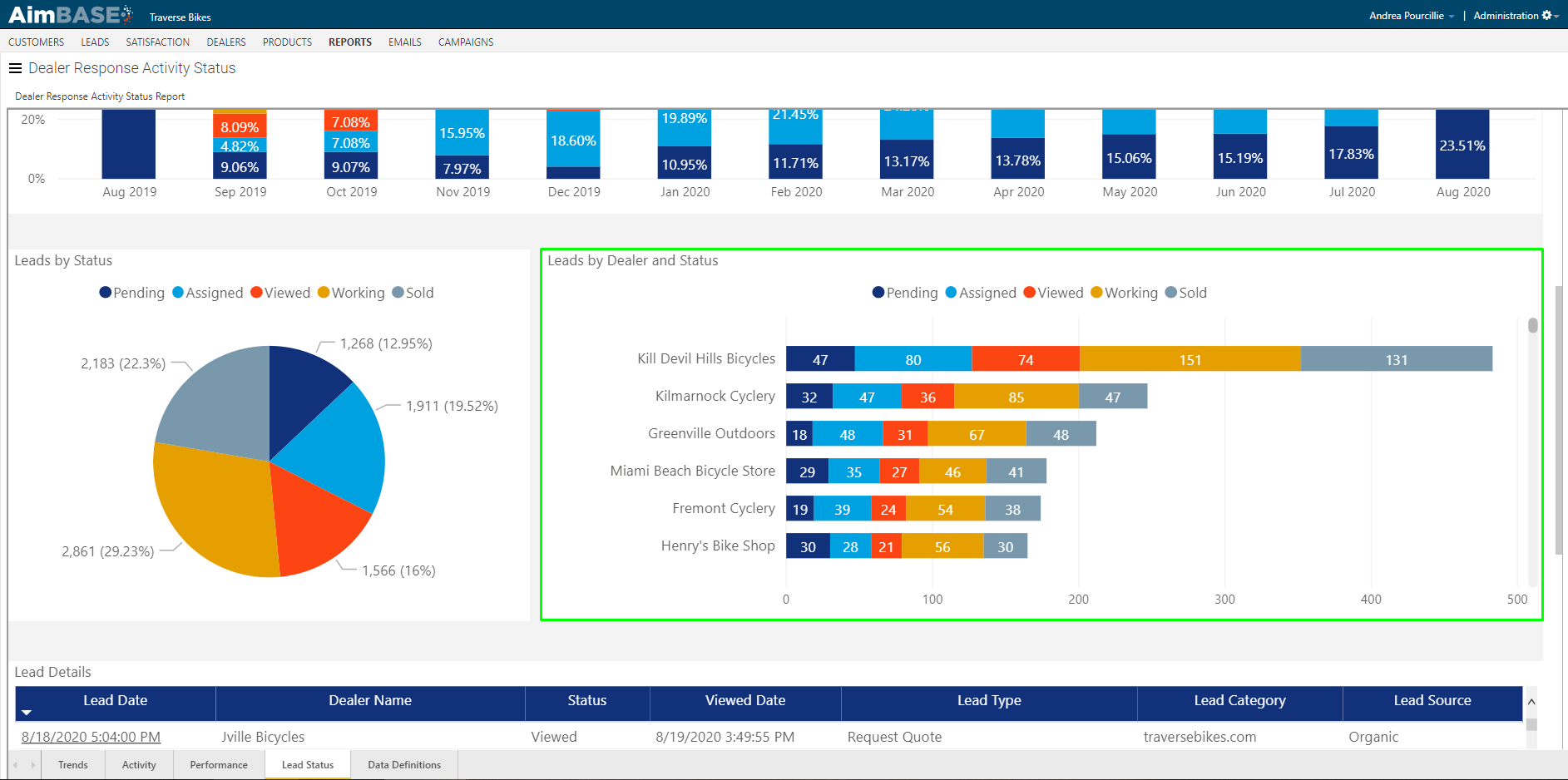
What does the Leads by Status section show?
The pie chart on the tab allows you to see holistically how the leads are distributed across lead statuses for the time period of the report. This view gives you the visibility to determine if dealers are actively responding to your leads and continuing to guide them through the sames cycle.
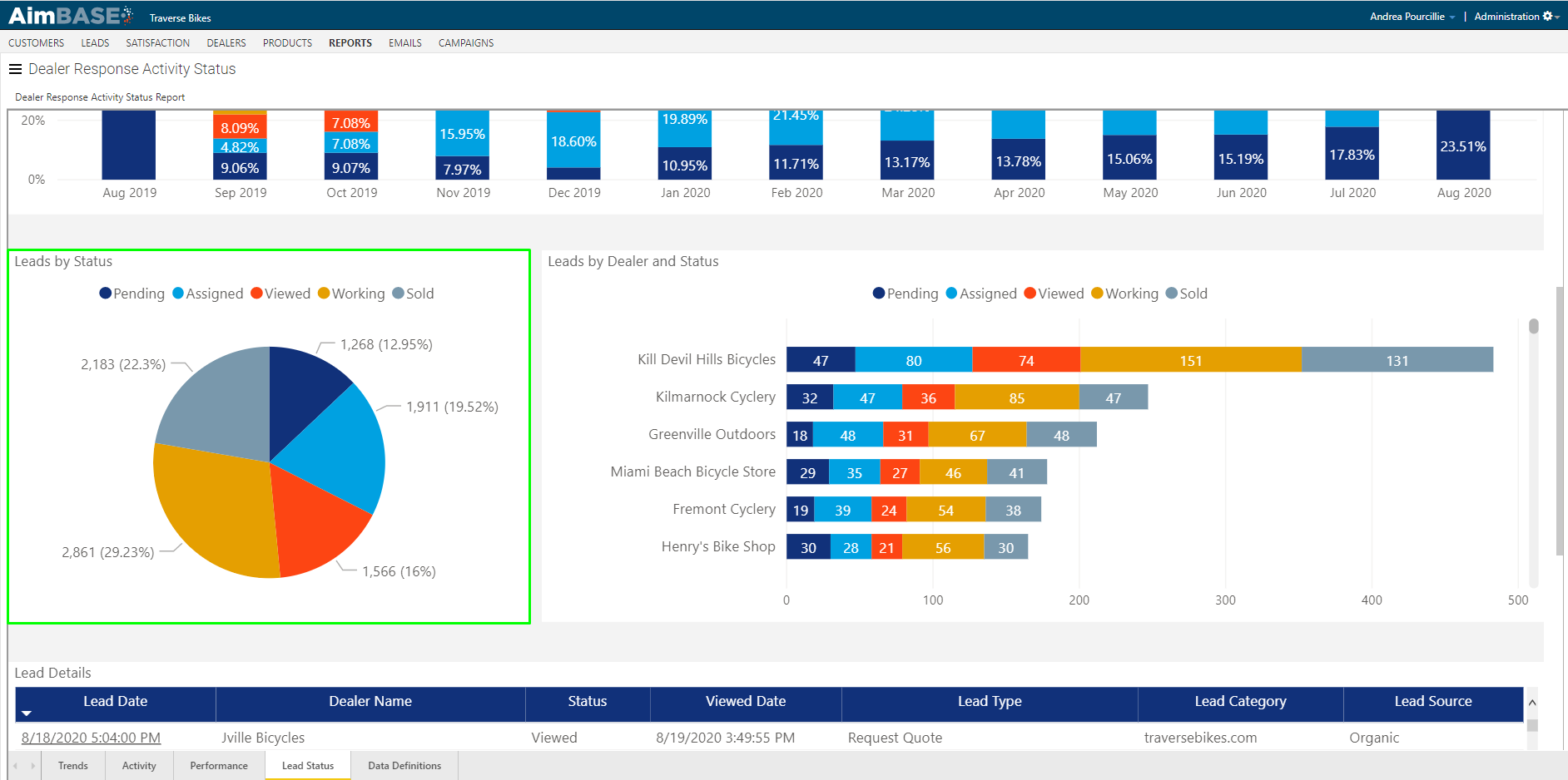
What does the Leads by Dealer and Status section show?
The last chart available on the tab will give you similar data to the first. This one, however, provides an added level of granularity. Here, you are able to see, by dealer, how many leads are in each lead status. From this view you are able to identify dealers who are highly responsive, and if there are dealers who need additional guidance or training on lead management.
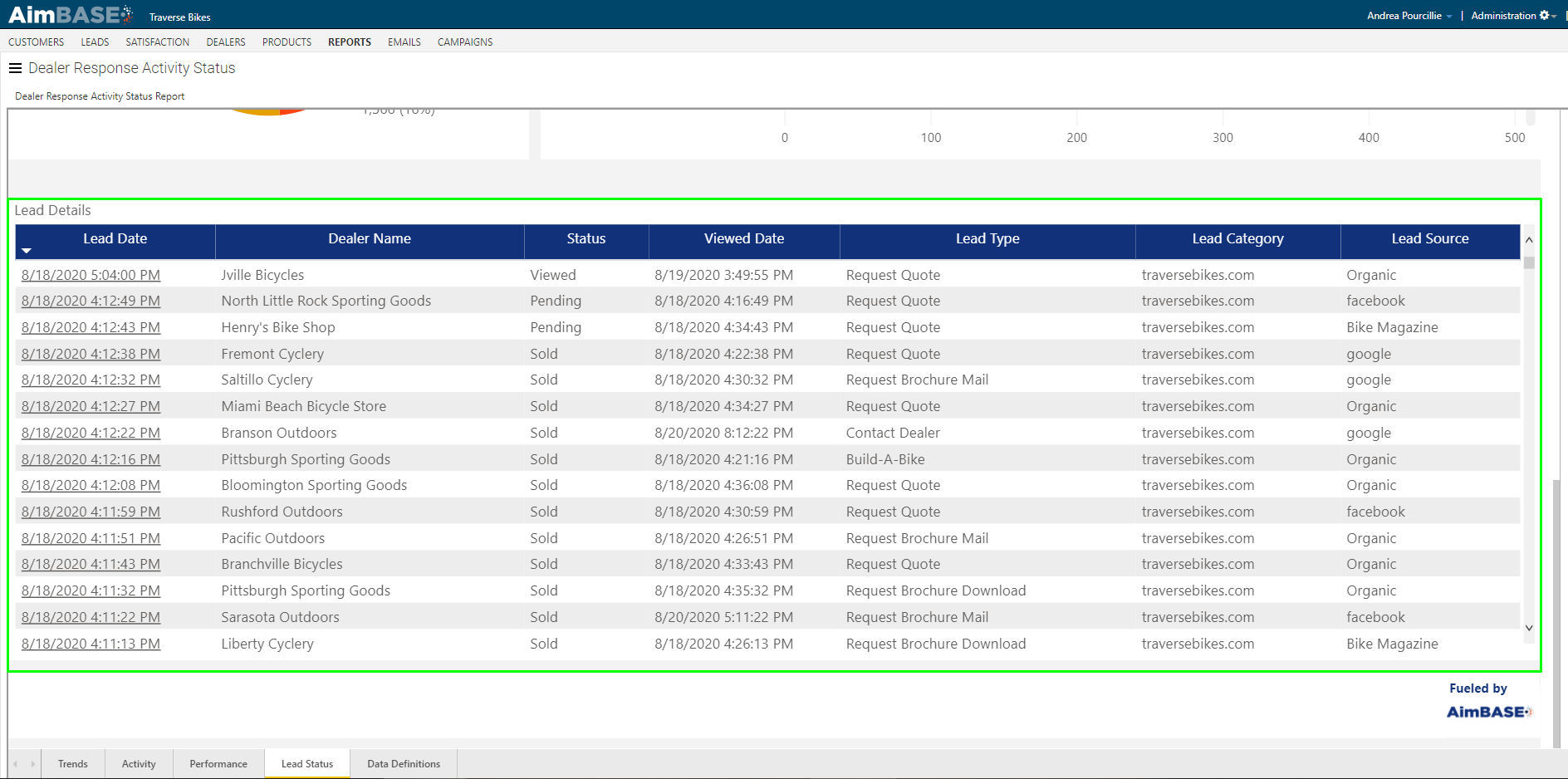
What information is included in the Lead Details section?
Finally, at the bottom of the tab are the lead details. This list view allows you to see all leads with a status that are being reported on. From this view you are able to see high-level details about each lead. Aside from seeing the assigned dealer, the lead status and the lead type, in the first column of the table is the lead date. By clicking on the lead date in a given row, you are able to navigate directly to the lead details page for that specific lead.
FAQs
What does the Dealer Response Activity Report allow you to see?
It allows you to see whether dealers are viewing their leads and how quickly they are viewing them after receiving them.
Why is dealer lead‑view behavior important for an organization?
It helps promote lead‑to‑sale conversions and allows organizations to set follow‑up time goals for dealers and sales teams.
How does Aimbase determine whether a lead has been viewed?
A lead is considered viewed when the person who receives the “Lead to” notification email opens the lead using the View Lead link in that specific email or views it through Aimbase while logged in under the same email address.
Does opening a forwarded notification email count as viewing a lead?
No. Clicking a link in a forwarded “Lead CC” email does not count unless the person opening it is using the original “Lead to” email address that received the notification.
Where are the default filters for this report located?
They are located at the top of each tab in the report.
What can the report filters be used to control?
They can be used to select date range, dealer number, region, brand, and other options to narrow the displayed data.
What information does the report provide about response‑rate trends?
It shows KPIs related to response rate, the monthly response rate, and comparisons to the same time frame in the prior period.
What metrics are included in the KPIs section?
It includes total leads entered, leads viewed, percentage viewed, average time to view a lead, and year‑over‑year change in viewed percentage.
What does the Lead View % by Period graph display?
It displays the percentage of leads viewed by month, with drill‑up options for quarterly data and tooltips that show lead totals and percentages.
What does the Response Time by Period graph show?
It shows response times in hours and compares current period response times to the same period in the prior year.
What information does the Activity tab provide?
It shows lead response time per dealer and helps identify dealer performance issues or situations where the wrong person—or no one—is receiving lead notifications.
What does the toggle on the Activity tab filter for?
It filters the modules on the Activity tab to show only leads distributed via email notification or via a CRM that sends disposition data back to Aimbase.
What does the Lead View % by Dealer chart show?
It displays each dealer’s lead view percentage and allows scrolling and sorting to find top or low‑performing dealers.
What does the Number of Leads Sent to Dealer CRM module show?
It shows how many leads were distributed to dealers via CRM and includes a trend line showing the percentage of total leads this represents.
What does the Number of Dealers Receiving Leads to Their CRM chart indicate?
It indicates how many dealer locations are receiving their leads within a CRM.
What information is shown in the Viewed pie charts?
They show the percentage of leads viewed for different distribution methods:
- Email only
- CRM with disposition
- CRM without disposition and email
- CRM without disposition only
Can the Viewed pie charts be used to filter the tab?
Yes. Clicking a chart segment filters the rest of the tab to that subset of leads.
What does the Lead Response Time by Dealer table display?
It displays dealer info, number of assigned leads, number viewed, average hours to view each lead, and the same time expressed in days/hours/minutes, along with totals for all metrics.
What does the checkbox above the Lead Response Time by Dealer table do?
It filters the table to show only leads that were viewed and distributed via email or a CRM with disposition.
What does the Weighted Lead Response Distribution report show?
It shows clusters of lead volume per dealer compared to the percentage of those leads viewed, represented by colored bubbles.
What does bubble size represent in the weighted distribution chart?
It represents the dealer’s average response time, with larger bubbles indicating longer times.
What do the axes represent in the weighted distribution chart?
The X axis represents lead volume, and the Y axis represents percentage viewed.
What does the Lead Status tab show?
It shows the status of leads to provide insight into the type of work being done with them.
What statuses might appear in the Lead Status tab?
Statuses may include Viewed, Assigned, Working, Sold, and Inactive.
What does the Leads by Status and Period chart display?
It displays the percentage of leads in each status by month, with options to view quarterly or weekly data.
What does the Leads by Status pie chart show?
It shows how leads are distributed across statuses for the selected time period.
What does the Leads by Dealer and Status chart show?
It shows how many leads each dealer has in each lead status.
What does the Lead Details section display?
It lists all leads with a status included in the report and shows high‑level details such as assigned dealer, lead status, lead type, and lead date.
Can users open individual lead records from the Lead Details section?
Yes. Clicking the lead date opens the lead details page for that specific lead.