
The survey recap report is a powerful tool which provides metrics pertaining to your surveys sent and received. With this report you're also able to follow trends that occur with responses to your open and closed ended questions at a glance.
Survey Recap Dashboard Tab
The Dashboard tab allows you to see many different, high-level metrics on one screen. Modules such as KPIs, overall product satisfaction, rolling 12 month survey response trends, returned survey sources, NPS trends and an owners by location map allow you to understand how your customers feel about your product and from where and how they are providing you this data.
Watch the Survey Recap Dashboard Training Video
To begin using the report, first ensure that your date filters are set for the time frame for which you'd like to analyze the data. To the right of the date filter are a series of other filters available for the report. However you configure these drop downs will determine the data set you see throughout each tab of the report.

KPIs
The KPI section gives you the ability to see key metrics at a glance. The first metric in the KPI section is reflective of total surveys sent within the current time frame (with the time frame being which ever dates you entered into the filter).
The second metric indicates the total number of surveys received (surveys submitted by your customers) for the same date range.
The first percentage that's visible within the KPIs reflects the response rate based on the first two metrics.
The fourth metric allows you to see if that response rate has increased or decreased from the prior time frame. In this case, our response rate of 67.32% is 21.86% lower than what it was from 10/1/2021 to 6/10/2024.

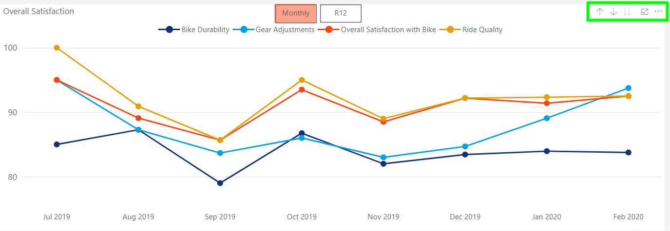
Overall Satisfaction
This graph provides metrics relating to how customers answered any OSAT, or overall satisfaction, questions on your survey. For these metrics you'll find both a trend line and a table. Each line on the graph is representative of a specific OSAT question. For example, the question relating to the Bike Durability line on the graph below likely asked the customer to "Rate [his/her] overall satisfaction with the durability of the bike that was purchased." The table beside the trends represents the average score for the timeframe you've run the report.

To look at the trends based on data that was collected in each month versus analyzing it based on a R12 data set ending in each month, utilize the monthly and R12 toggles at the top of the chart.
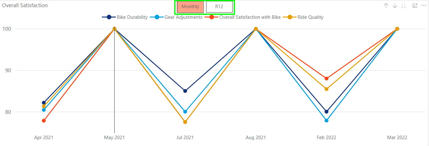
To see more detail about each data point, hover over a dot on the graph. Within the box you'll see specific data points relating to each line for the month you hovered over.
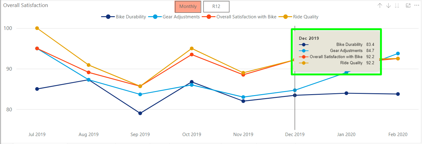
To interact more with this graph, utilize drill mode, focus mode and other tools at the top-right of the graph. For more information about how these functions work, reference the Introduction to Power BI article here.
Another way to garner more information from the trend data is to employ the help of the slicers at the top of the report. By default the report shows all data your account has been given permission to access for the brand(s) or manufacturer. The slicers, or filters, at the top of the report allow you to see a subset of this data based on more specific criteria.
For example, if you are trying to understand what a particular dealer's or dealer group's satisfaction scores are, you could use the Dealer Name or Dealer Number slicer at the top of the report. In the view below, we've used the Dealer Name slicer to choose a single dealer location from the list. Now, all data displayed within the report will be reflective of only that location. This allows you to understand how each dealer is performing according to your customers, and pinpoint if there are delivery, service or other issues at that particular location regarding your products.

You can also see dealer-specific metrics without using the filters by navigating to the data table within the Dealer Results tab of the report.
Survey Activity
The Survey Activity graph makes it possible to see, month-by-month the number of surveys sent versus the number that were received, along with a trend line to help you understand if your response rate is increasing or decreasing over time.
When the graph initially loads, the bars on each month represent only data collected within that month as noted by the box that says Monthly highlighted in orange. If you select the R12 box beside it instead, the bars will represent a rolling 12-month period for each month.

Responses by Source
The Responses by Source graph allows you to see how your customers are submitting their surveys. A typical survey invite cycle includes one or two attempts at inviting the customer to take the survey online. If no response is received, then a paper survey is mailed to the customer to fill out and return. Here, you're able to determine which method of survey entry is gaining you the most responses.

Net Promoter Score
This graph displays data pertinent to your NPS (net promoter score) questions. These questions typically ask the customer how likely he/she is to recommend the brand or selling dealer. If you do not ask these questions on your survey, this graph will not appear on your Survey Recap Report.
In the graph below, you'll notice that each line represents an individual NPS question.

Owners by Location
The last element on the Survey Recap Dashboard tab is a heat map showing where your owners are from. The darker the color, the higher the owner density for that country or state/province within the country. If you have a lot of owners globally, it might be helpful to use this element in focus mode.

Satisfaction Indicators Tab
Within the Satisfaction Indicators tab you're able to see more detail about the averages for the OSAT questions. In this tab the metrics are displayed to show you total number of responses, satisfaction score for the report period and the prior period, and the manufacturer's score for the report period.
Watch the Satisfaction Indicators Training Video
Each bolded title on the list represents an overall satisfaction question on the survey. When the row for the question is collapsed (as is for Gear Adjustments below) you're able to see the average metrics for chosen time period of the report. When the row is expanded (as is for Bike Durability), you see the same metrics reported month-by-month rather than the entire report period.
Note you may see the values in the Satisfaction Score column and the Manufacturer column are the same. This can happen when the report has not been filtered to only display data for a certain dealer. If you were to filter down to a single dealer on the report, the scores in the first three columns would reflect the dealer's scores. The scores in the Manufacturer column would still reflect the manufacturer scores. This allows you to see how a single dealer is performing relative to your company as a whole.

Survey Results Tab
Within the Survey Results tab you're able to see metrics related to the other non-OSAT and non-NPS questions on the survey that have multiple choice options. In this tab the metrics are displayed to show you total number of responses, the percentage of respondents that answered a question along with the same percentage for the prior time period, and the manufacturer's response rate.
Watch the Survey Results Training Video
When the row for the question is collapsed (as is for Age) you're able to see the average metrics for that question. When the row is expanded (as is for Gender), you see the same metrics but they are reported based upon the available multiple-choice answers for that question. If you ever see less than 100% listed for a question when it is collapsed, that indicates that not all survey submissions included a response to that particular question.
As is the same in the prior tab, if you were to filter down to a single dealer on the report, the values in the total Responses, response % and prior % columns would reflect that dealer's scores. The scores in the Manufacturer column would still reflect those of the manufacturer. This allows you to see how a single dealer is performing relative to your company as a whole.

NPS - Net Promoter Score
The NPS tab of the report displays data and metrics related specifically to the NPS questions on a survey. These questions typically ask customers if they would recommend the brand to a family member or friend and would they recommend the selling dealer to a family member or friend. If NPS questions are not present on your survey, then this data won't be available.
Watch the NPS Training Video
Net Promoters
Below the filters, in the first module of the tab, you'll see the questions on your survey for which data is reported within the tab. In the example below, the default setting is for the question which represents the manufacturer to be selected. To see data specific to one question or the other, check the radio button next to the question for which you'd like to see the data.

NPS by Period
In the NPS by Period module you're able to see the NPS scores reported monthly. In the first column you'll see the number of responses received. In the subsequent columns you'll see the average NPS scores for the month, and then the same month for the prior period.

NPS Donut Graph
In this module, you're able to see a variety of information. First, in the colored circles you'll find the total numbers for each type of response. To the right, within the gray bars, you'll find data indicating what percentage of responses each represents. Finally, the circular donut gives you the visual representation of those percentages along with the overall average NPS score in the middle.

Response Types by Period
The last module on the tab displays more data distinguishing between promoters, passives and detractors. With this graph you're able to gain insight into if any trends are present with regard to the number of promoters, passives and detractors your brand has surveyed.

Survey Response Details
Within the survey response detail tab you'll find more detailed information about the people and responses being reported on in the other tabs of the report. These records that appear in this tab are determined by the filters you set on the report. From this page you can navigate to a specific survey response by clicking the serial number link in the left column in the list of records.

If you click on the row containing the record rather than the serial number, the table below the initial list (scroll down on the report to see this) will display the responses for that specific submission directly in the report.


Dealer Results
Within the Dealer Results tab you'll find a consolidated table that displays each dealers average score for the timeframe of the report. The table will display the averages for all OSAT and NPS type questions.

FAQ's
1. What is the Survey Recap Report?
The Survey Recap Report is a tool that provides metrics related to surveys sent and received. It helps users follow trends across survey responses at a glance.
2. What can I view on the Survey Recap Dashboard tab?
The Dashboard tab displays high‑level metrics including KPIs, overall satisfaction, rolling 12‑month survey trends, response sources, NPS trends, and an owners‑by‑location heat map.
3. What do KPIs represent in the report?
KPIs include:
- Total surveys sent in the selected timeframe
- Total surveys received
- Response rate
- Change in response rate compared to the prior period
These values are driven by the date filters applied at the top of the report.
4. What is shown in the Overall Satisfaction section?
The Overall Satisfaction (OSAT) graph displays trend lines and an accompanying table showing average scores for each satisfaction question during the selected timeframe. Each line corresponds to a specific OSAT question.
5. How can I view monthly vs. rolling 12‑month (R12) trends?
Many graphs, including Overall Satisfaction and Survey Activity, allow toggling between Monthly and R12 views using buttons at the top of the chart. Monthly reflects data collected within each month, while R12 shows rolling 12‑month data.
6. How do filters and slicers affect the report?
Filters determine the entire dataset displayed across all tabs. Slicers at the top allow users to view data for specific criteria (e.g., dealer name or dealer number). Selecting a dealer shows performance metrics only for that location. There are additional filters along the right side of the report.
7. What does the Survey Activity graph show?
This graph compares the number of surveys sent vs. received each month, with an optional trend line indicating how response rates change over time. Monthly and R12 views are available.
8. What does the Responses by Source graph represent?
It shows how customers submit surveys—typically email (one-click online survey), text (SMS), online through by entering a URL and survey key ID (Cover Letter) or by paper(Mailed in Survey) or postcard (QR Code). This helps identify which entry method yields the most responses.
9. What is included in the Net Promoter Score (NPS) section?
NPS graphs display data for questions asking how likely customers are to recommend the brand or selling dealer. Each line represents an individual NPS question. If no NPS questions exist on a survey, these graphs do not appear.
10. What does the Owners by Location map show?
It is a heat map showing where product owners are located. Darker regions represent higher owner densities, and focus mode can help when owners are spread worldwide.
11. What information is provided on the Satisfaction Indicators tab?
This tab displays detailed averages for OSAT questions, including:
- Total responses
- Satisfaction score for the selected period
- Prior‑period satisfaction score
- Manufacturer average
Rows can be expanded to show monthly data.
12. What is shown on the Survey Results tab?
This tab reports metrics for all non‑OSAT and non‑NPS multiple‑choice questions, including response counts, response percentages, prior‑period percentages, and manufacturer response rates. Expanded rows show detailed breakdowns for each answer choice.
13. What information is available on the NPS tab?
The NPS tab provides:
- A selection of available NPS questions
- Monthly NPS scores and response counts
- Donut graphs showing promoters, passives, and detractors
- Trend graphs tracking these categories over time
If the survey lacks NPS questions, this tab is not populated.
14. What can I find in the Survey Response Details tab?
This tab lists individual survey submissions based on selected filters. Users can click a serial number to open the full response or click a row to view response details in the table below.
15. What does the Dealer Results tab show?
This tab contains a consolidated table displaying each dealer’s average scores for all OSAT and NPS questions within the selected timeframe.