The Lead Count Report helps you understand where your leads are being captured and the type of lead requests you are receiving from your customers. In this report, you will see a breakdown of the lead type, lead category, and lead source. You can also view the top products and campaigns, understand when your prospects are the most active and their location.
Watch the Full Training Video
To understand the navigation for PowerBI reports, please reference Introduction to Using PowerBI Reports at https://help.gorollick.com/86143-reports/how-to-use-report-drill-downs.
What information does the Lead Count tab provide?
Within the lead count tab you're able to see and interact with data that gives you insight into several key metrics. Within the lead count section, you'll learn more about KPIs, year of year metrics, time of day metrics, product of interest metrics, campaign, location and event metrics.
What KPIs are shown in the Lead Count Report?
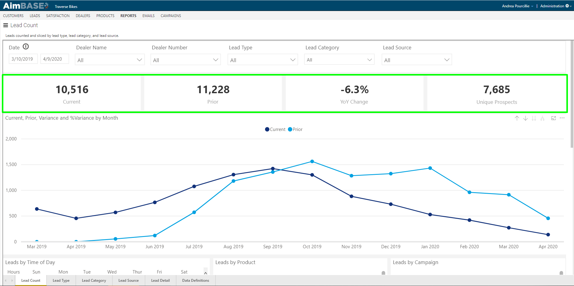
The KPI section gives you the ability to see key metrics at a glance. The first metric in the KPI section is reflective of total leads within the current time frame (with the time frame being which ever dates you entered into the filter).
The second metric indicates the total lead count for the same date range of the prior period. In this example, that would mean that between 3/10/2018 and 4/9/2019 11,228 leads were entered.
The negative percentage that's visible within the KPIs reflects the percentage change between the two time frames. Because the volume of leads has decreased year over year, the percentage is negative.
The fourth metric gives you some additional context as to how many people expressed interest in your brand versus asked to be contacted in one way or another. This is an impactful number to consider since it is not uncommon for a prospect to enter multiple types of leads within his/her buying journey.
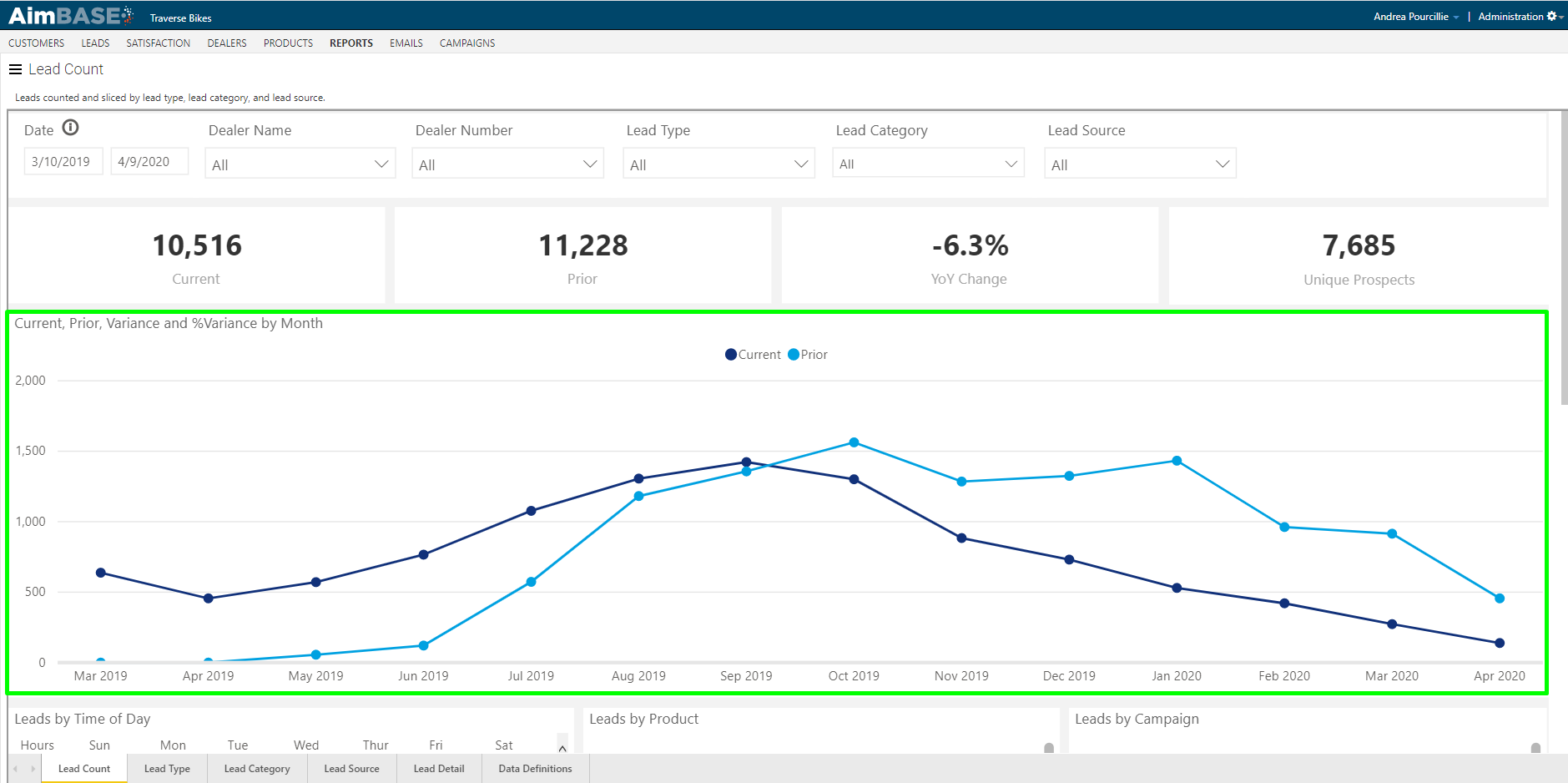
What does the YoY Lead Variance graph show?
This graph shows lead volume by month of your current time frame along with the volume from the same time frame of the prior year. The darker blue is representative of the current time frame and the lighter blue indicate volume from the prior time frame.
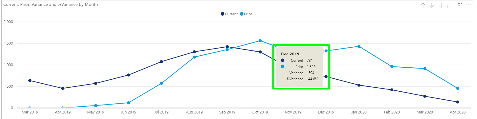
This graph offers some interactivity as you hover over individual data points. In the example below, you can see that more detail becomes available when you hover over the dot representing December of the prior time frame.
Another way to interact with this graph is by utilizing the icons in the top-right corner.
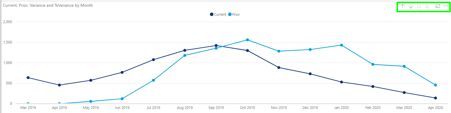
When you click the up arrow the graph will display data by quarter instead of by month. Clicking on the double down arrows will return the graph to showing data by month.
The single down arrow allows you to see more granular data about a single data point. To use this feature, click the down arrow, then click on the data point on which you'd like to see more granularity. When you make your selection, you'll notice that the metrics in the KPI section above the graph change to reflect the data you chose.
What does the Lead by Time of Day table show?
The next table provides data that shows you which days and at what times your lead volume is the highest. The darker the block, the higher the lead volume. Hovering over each block allows you to see how many leads were created during that hour of the respective day.
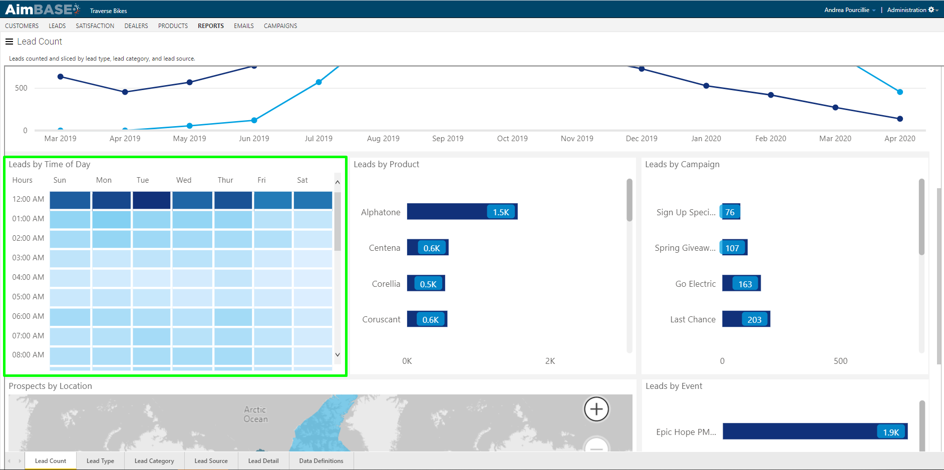
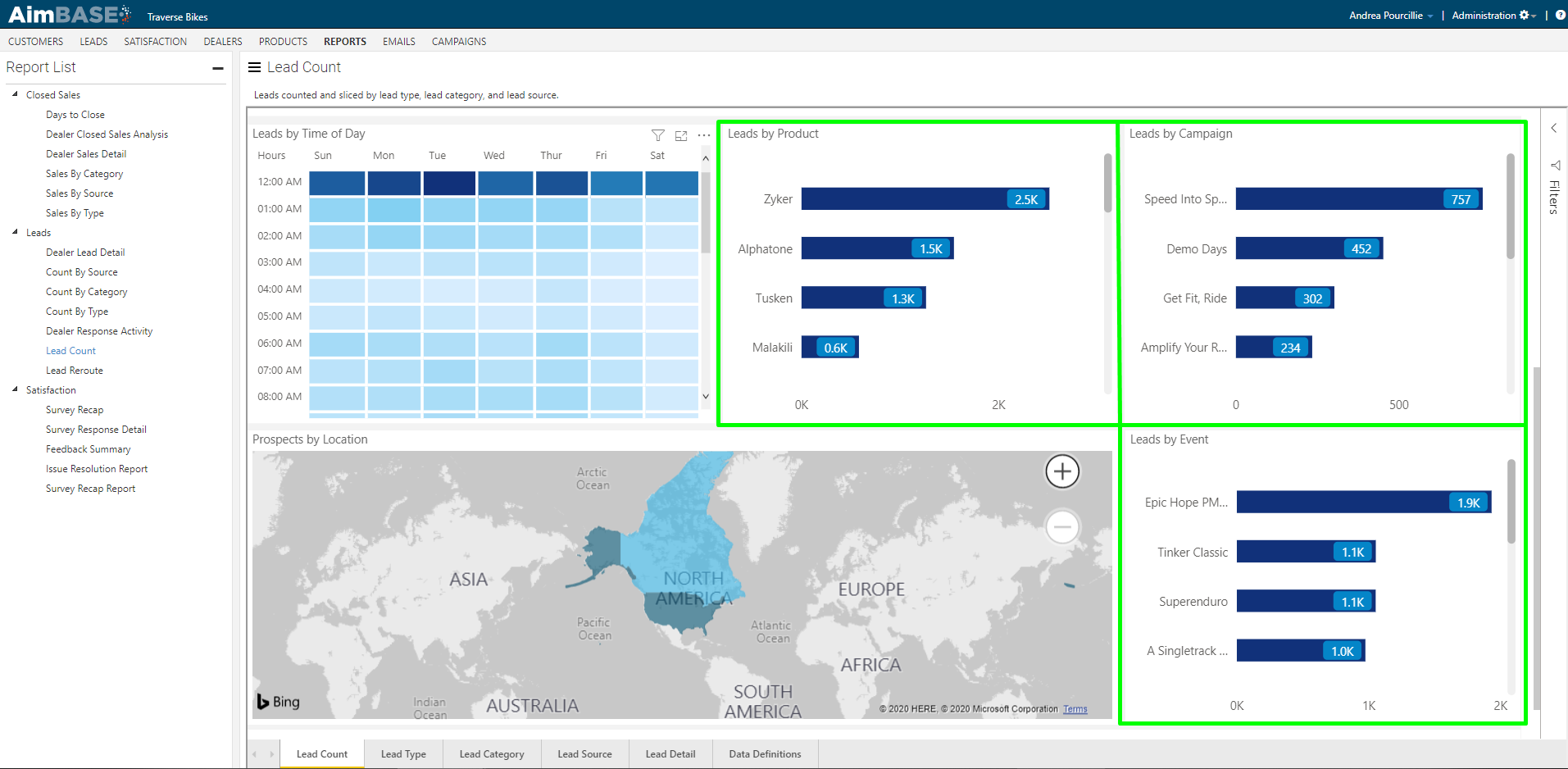
What do the Leads by Product, Campaign and Event graphs display?
These three graphs help you understand which of your products prospects are most interested in, which of your campaigns are producing the most lead conversions and at which events you collect the most leads. Each of these graphs initially displays the records by highest to lowest lead volume.
What does the Prospects by Location view show?
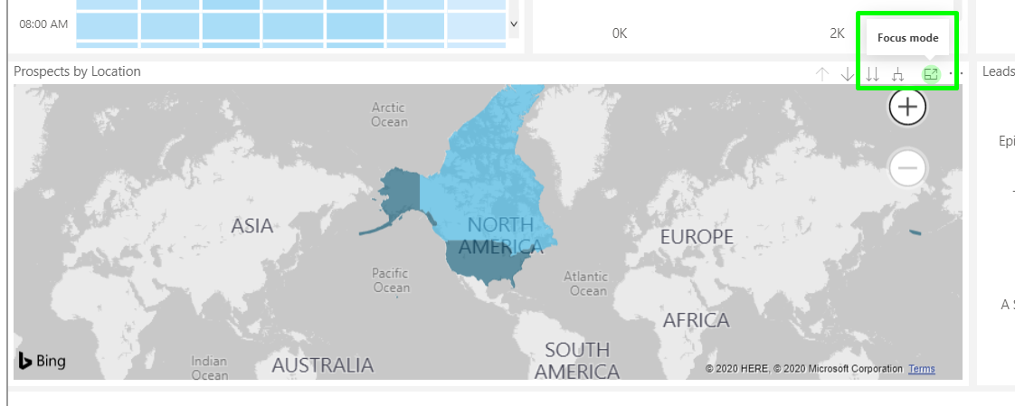
The last element on the Lead Count tab is a heat map showing where your prospects are from. A couple of key items to note for this element are that this is by prospect (not lead) and that the color coding is similar to that of the Lead by Time of Day table. The darker the color, the higher the prospect density for that country. If you have a lot of prospects globally, it might be helpful to use this element in focus mode.
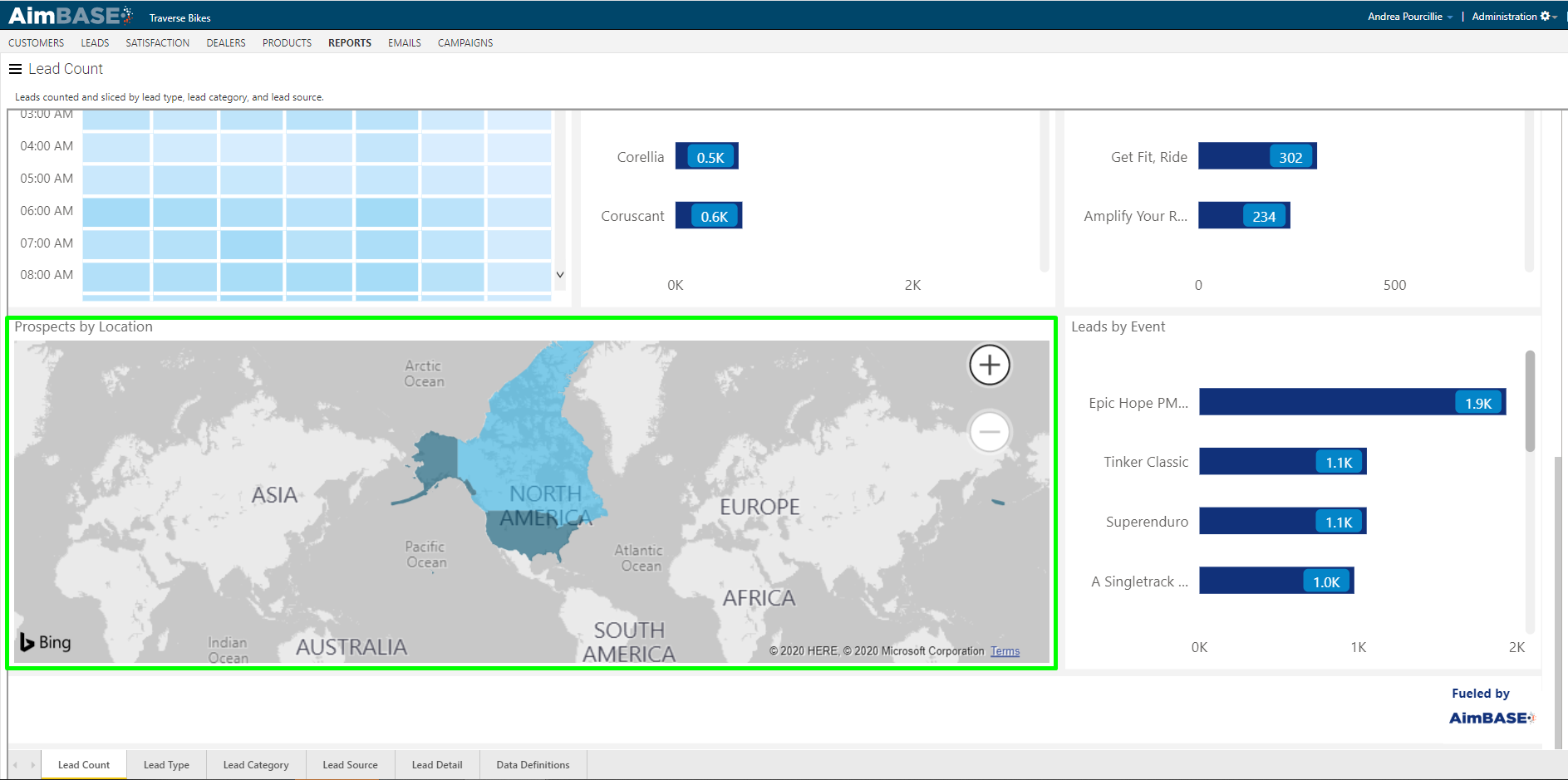
If you have a lot of prospects globally, it might be helpful to use this element in focus mode. To put the map in focus mode, click on the square with the arrow in the top-right corner of the map. To get out of the focus mode, simply click Back to Report in the top-left corner.
What information is available in the Lead Type, Lead Category & Lead Source tabs?
The Lead Type, Lead Category and Lead Source tabs within the report are dedicated to giving more information and detail specific to the various methods of categorizing leads that are submitted to your Aimbase install.
The same dates we had set in the Lead Count tab apply to all subsequent tabs.
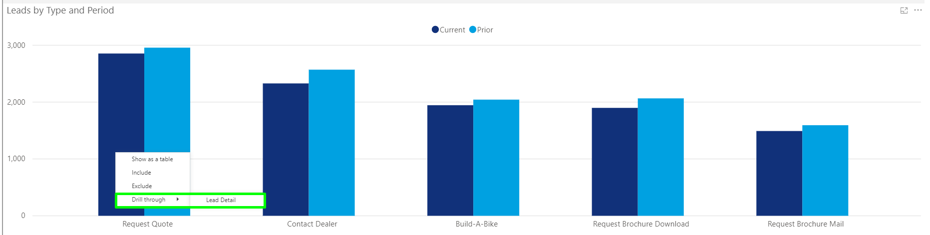
The first module in each tab, which looks like a traditional bar graph, shows you how many leads were submitted for each lead type, category or source (depending upon which tab of the report you're looking at) for the time period. The dark blue is the current period selected, and the light blue is the same period for the prior year. The same as the line graph in the Lead Count tab. You can see in this install, we have more leads in the prior year for each lead type. This means the variance will be negative for each lead type. You can hover over each bar graph and see the exact details.
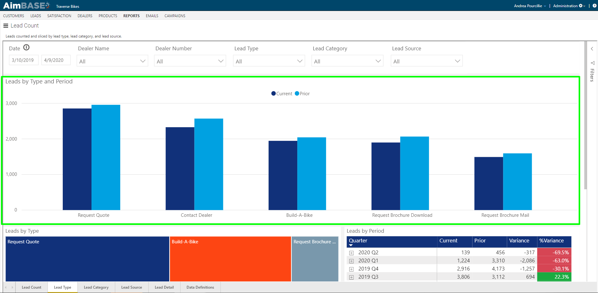
Another feature of the graph is its ability to direct you to other sections of the report that contain additional detail. To use this feature, hover over a bar and right-click. It will take you to the Lead Details tab and show you all the leads that are Request a Quote with all the Lead Details.
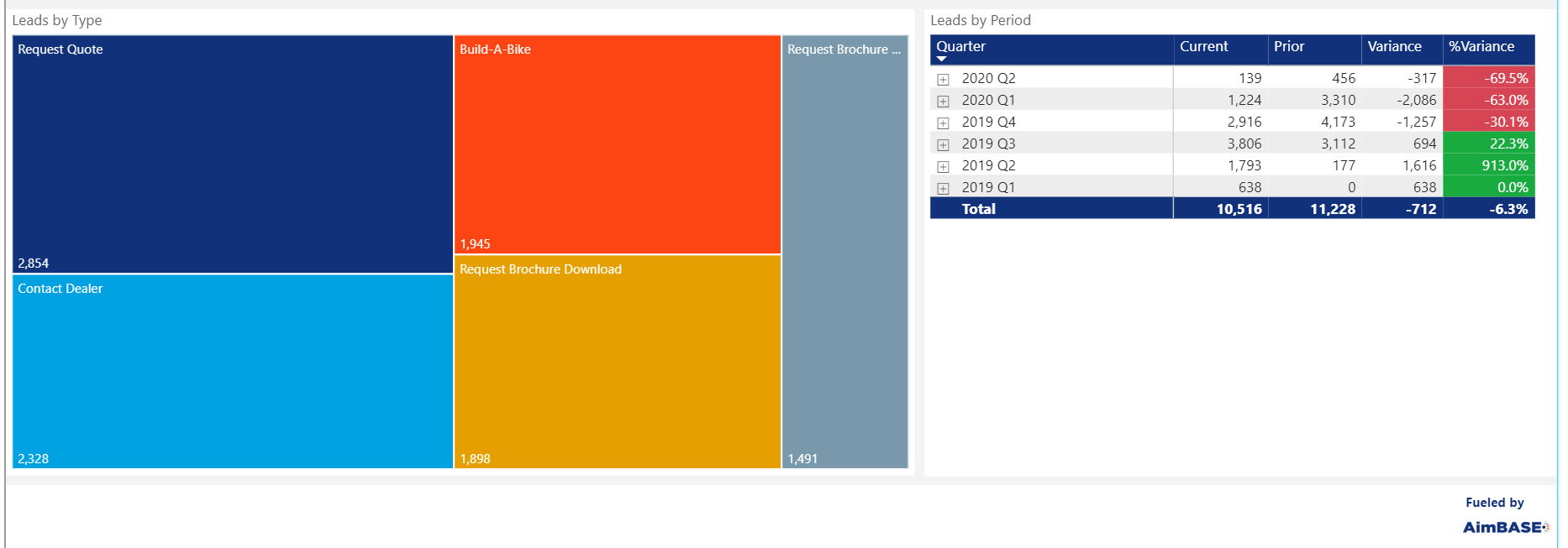
The Leads by Type, Leads by Category and Leads by Source modules assigns a color to each lead type, category or source and gives you a visual representation of the difference in the amount of leads for each.
The Leads by Period shows how many leads were received by a specific period of time. By default the table displays the data by quarter. By using the single drill down, double drill down, and double down split arrows you can expand multiple data sections one at a time or all at once or view the data by month.
What does the Lead Details tab provide?
The Lead Details tab gives you an advanced look at all the leads that have been submitted to your Aimbase during the selected date range.
The first module in the report allows you to see at a glance which dealers hold the most leads for the time frame of the report. Use the left/right scroll on this report to see more dealers.
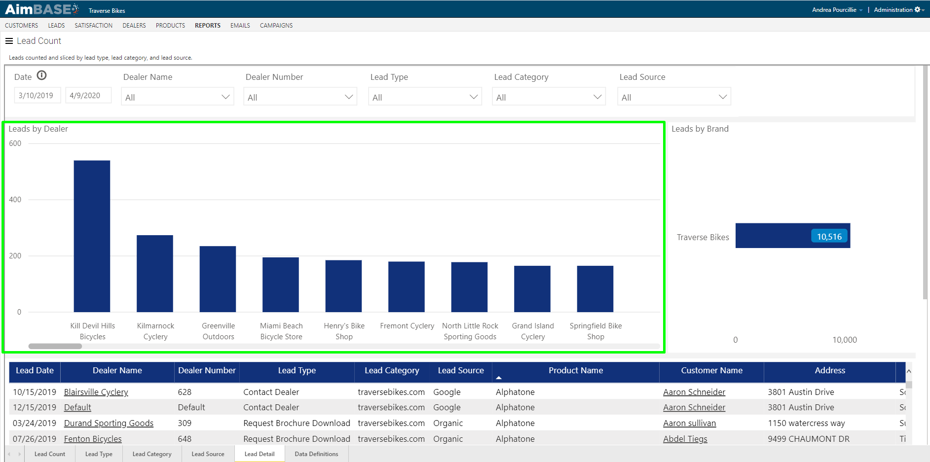
The second module within the tab shows how the leads for the time frame are spread across the brands in your Aimbase install. In this example there is only one brand, so the data is represented by a single bar.
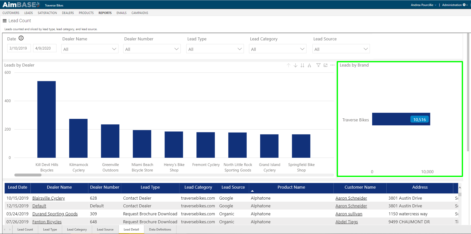
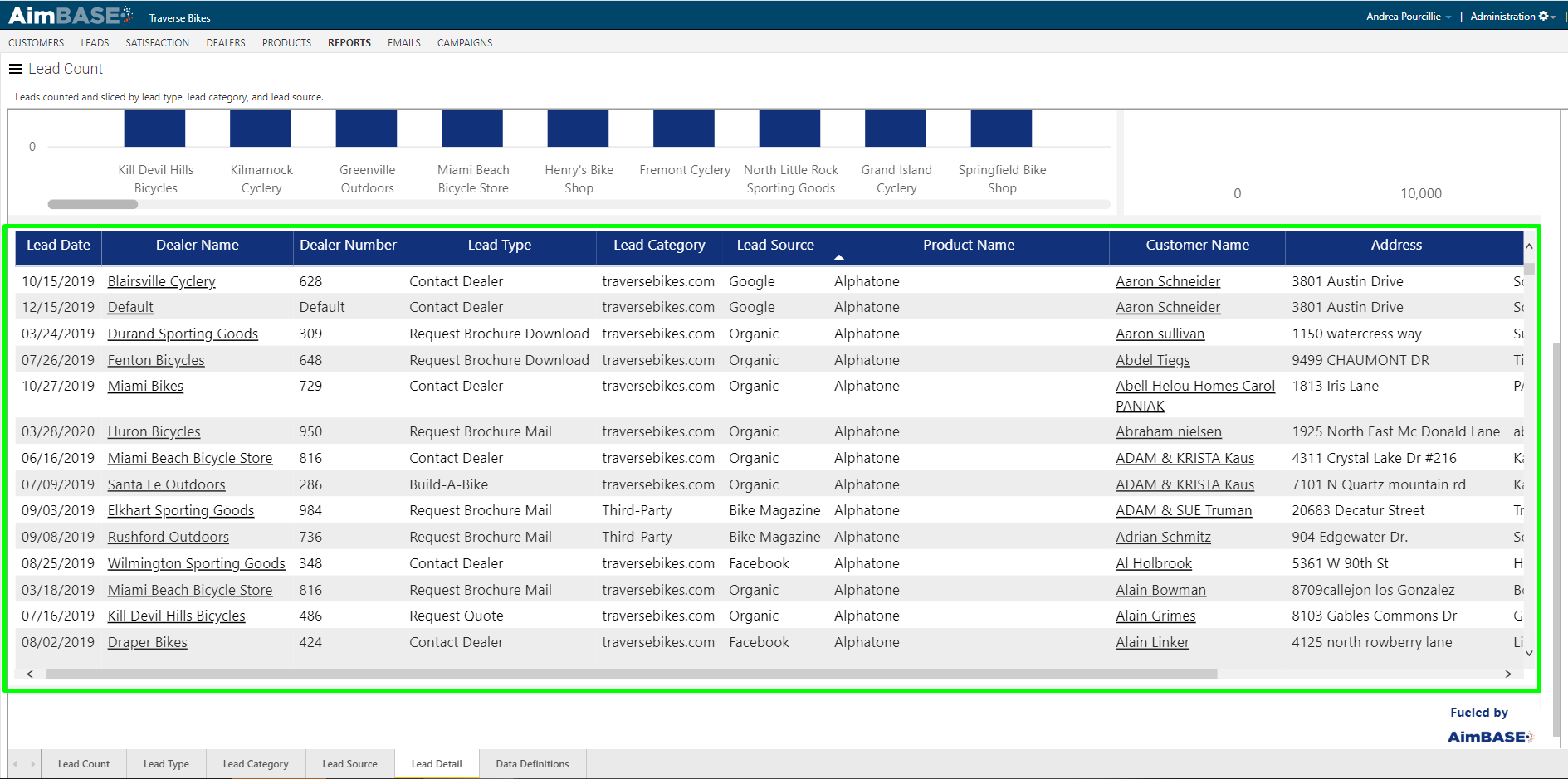
The list of data at the bottom of the lead details tab displays a list view of all leads included in the reported data set based on the filters set on the report. This module has both a left/right scroll and a top/bottom scroll. Scroll all the way to the right on this report to find the link icon:  . Click this icon in line with the lead you'd like to see more data about to navigate directly to that lead's detail page.
FAQs
What does the Lead Count Report help you understand?
It helps you understand where leads are being captured and what types of lead requests customers are submitting.
What information can be viewed in the Lead Count Report?
It shows lead type, lead category, lead source, top products, top campaigns, prospect activity timing, and prospect location.
What does the Lead Count tab allow you to explore?
It allows you to interact with data related to KPIs, year‑over‑year metrics, time‑of‑day activity, product interest, campaign data, location, and event metrics.
What does the first KPI metric show?
It shows the total number of leads within the selected time frame.
What does the second KPI metric show?
It shows the total lead count for the same date range in the prior period.
What does a negative KPI percentage indicate?
It indicates that total leads decreased compared to the same period in the prior year.
What does the fourth KPI metric represent?
It shows how many people expressed interest in the brand compared to how many asked to be contacted.
What does the YoY Lead Variance graph show?
It shows lead volume by month for the current period compared to the same months in the prior year.
What happens when you hover over a data point in the YoY Lead Variance graph?
More detailed information becomes visible for that specific month.
What do the drill icons on the YoY Lead Variance graph do?
The up arrow switches the view to quarterly data, the double‑down arrows return it to monthly data, and the single down arrow reveals more granular detail for a selected data point.
What does the Lead by Time of Day table show?
It shows which days and times have the highest lead volume, with darker blocks indicating higher volume.
What does hovering over a block in the Lead by Time of Day table display?
It displays the number of leads created during that hour on that day.
What do the Leads by Product, Campaign, and Event graphs show?
They show which products prospects are most interested in, which campaigns generate the most lead conversions, and which events capture the most leads.
What does the Prospects by Location heat map show?
It shows where prospects are located, with darker colors representing higher prospect density.
Does the Prospects by Location map display data by prospect or by lead?
It displays data by prospect.
How can you view the Prospects by Location map in focus mode?
Click the square with the arrow in the top‑right corner of the map.
What do the Lead Type, Lead Category, and Lead Source tabs show?
They show detailed information about leads categorized by type, category, or source for the selected date range.
What does the first module in each of these tabs display?
It displays the number of leads submitted for each type, category, or source, comparing the current period to the prior year.
What color represents the current period and prior period in these bar graphs?
Dark blue represents the current period, and light blue represents the prior period.
Can the bar graphs direct you to other report sections?
Yes. Right‑clicking a bar takes you to the Lead Details tab filtered to that lead type.
What do the Leads by Type, Category, and Source modules show?
They assign colors to each type, category, or source to visually represent differences in lead volume.
What does the Leads by Period table show?
It shows how many leads were received in each period, displayed by quarter by default, with drill options for more detailed or broader views.
What does the Lead Details tab provide?
It provides an advanced list of all leads submitted during the selected date range.
What does the first module in the Lead Details tab display?
It shows which dealers hold the most leads for the selected time frame.
What does the second module in the Lead Details tab show?
It shows how leads are distributed across brands in the Aimbase installation.
What does the list at the bottom of the Lead Details tab display?
It shows all leads included in the data set based on report filters, with both horizontal and vertical scrolling available.
How do you navigate to a specific lead’s detail page from the Lead Details list?
Click the link icon in the row of the lead you want to view.